Self-made Typefaces.
(2019-2022)
*drag letters to make a word!*
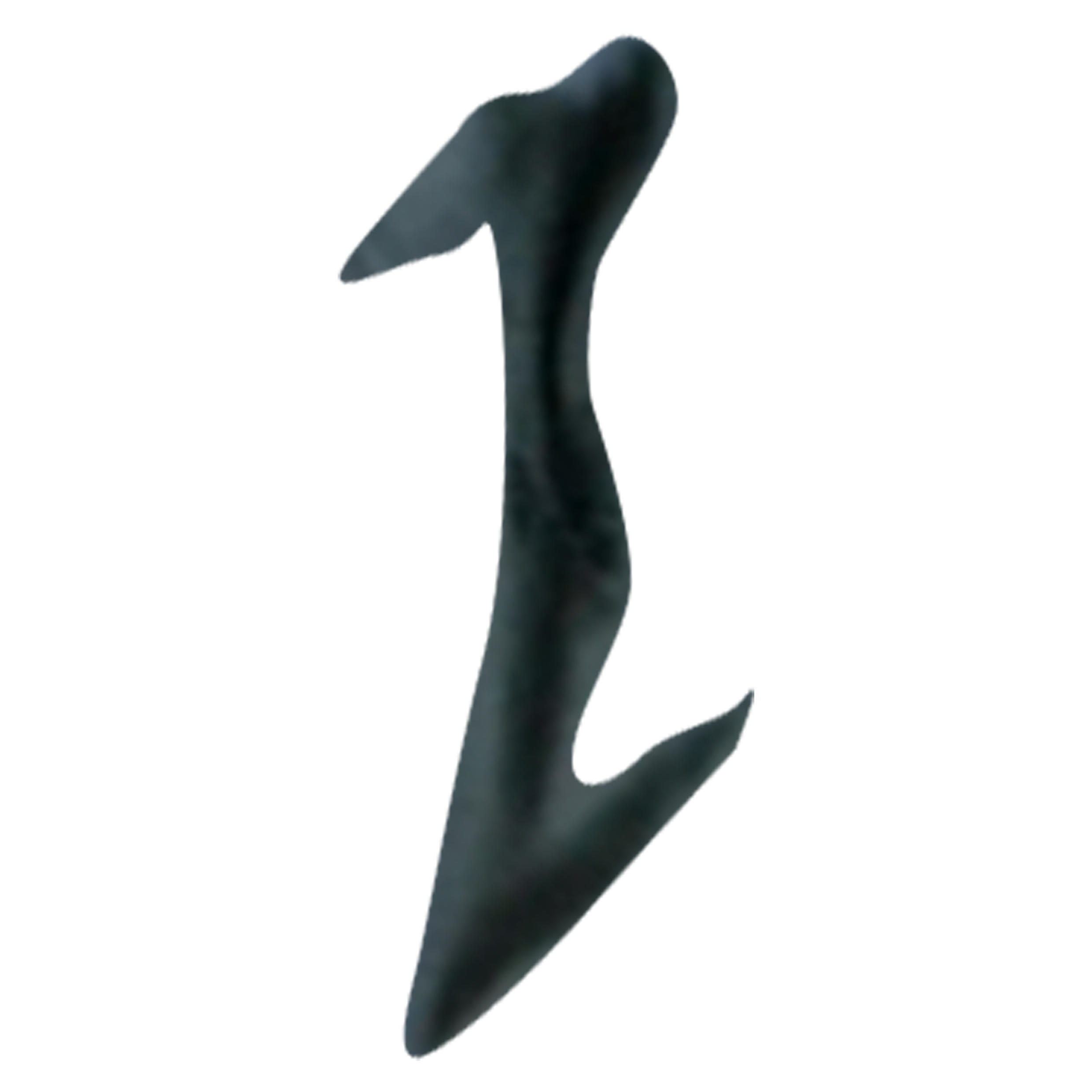
“Roid Rage”
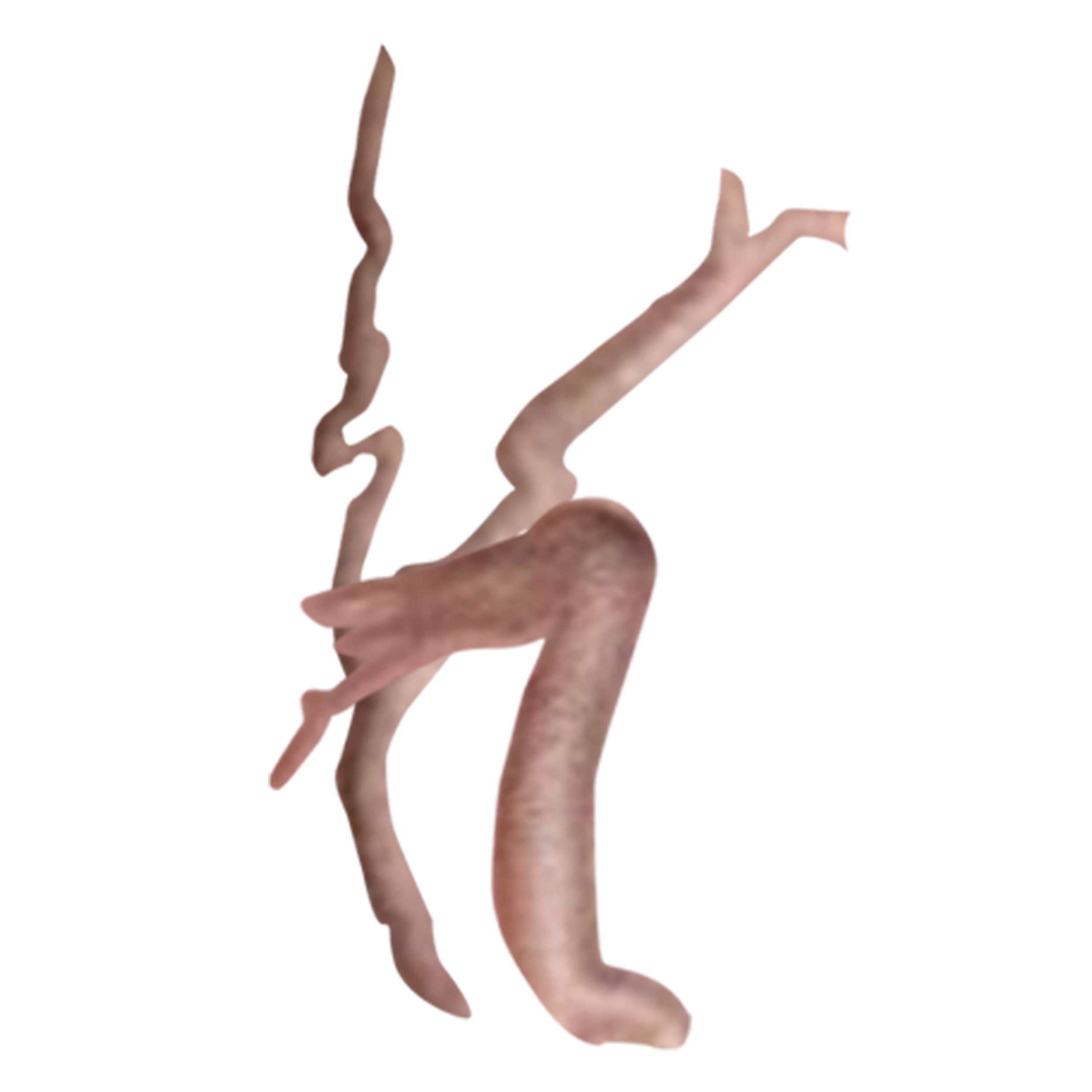
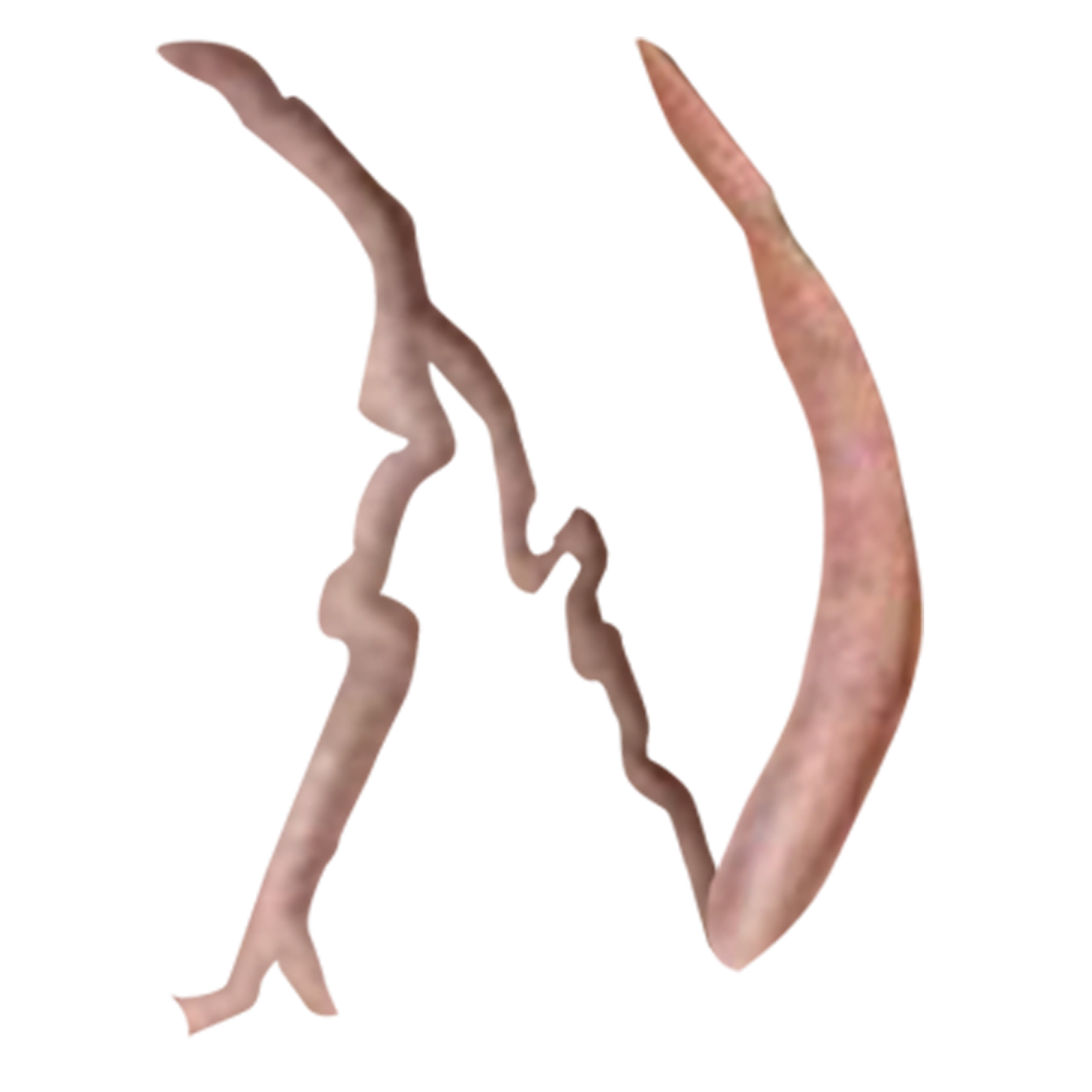
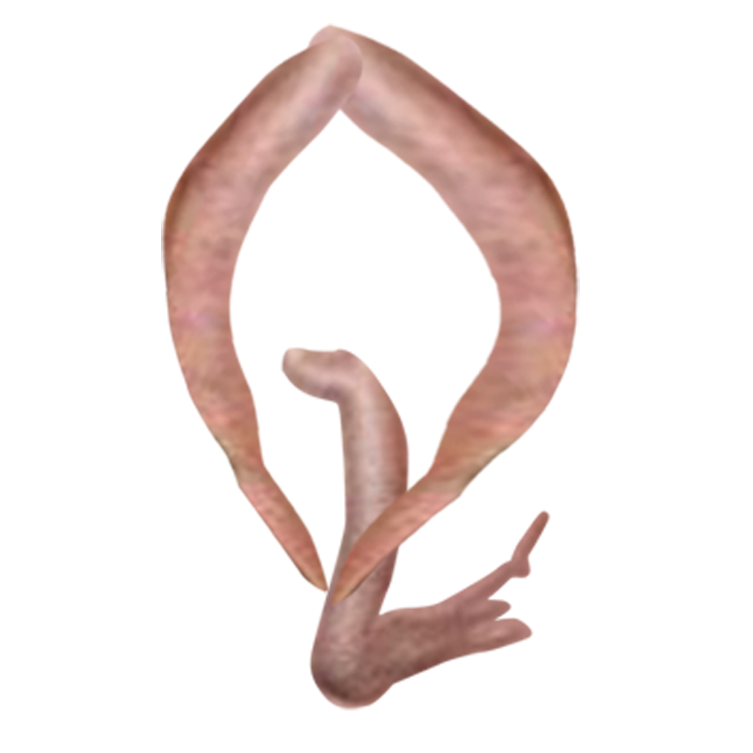
A surreal, crude and illustrative display font with letterforms taken from the pulsating viens of a raver in a photograph taken from within the Wigan ‘Donk’ scene in the early 2000’s. “Roid rage” embraces the grotesque in order to suit the purpose of representing a dance music micro-genre that is demonised by its critics for being too ‘lowbrow’ to be considered a legitimate artform. The main aim of the font was to subvert the idea of ugly and unrefined being out of place within design, and to showcase how an unattractive typeface can be utilised in a way that is expressive, interesting and fit for purpose within its correct context.


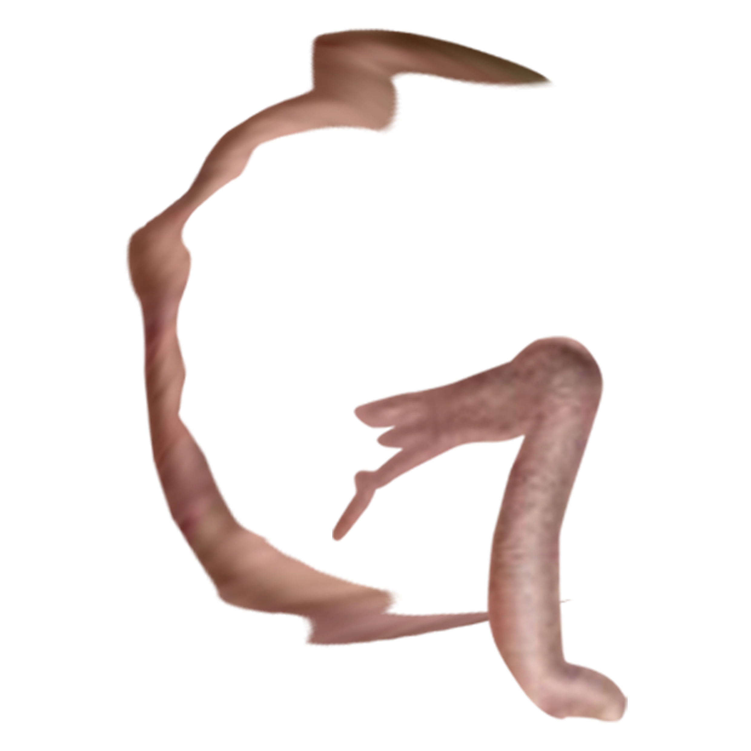
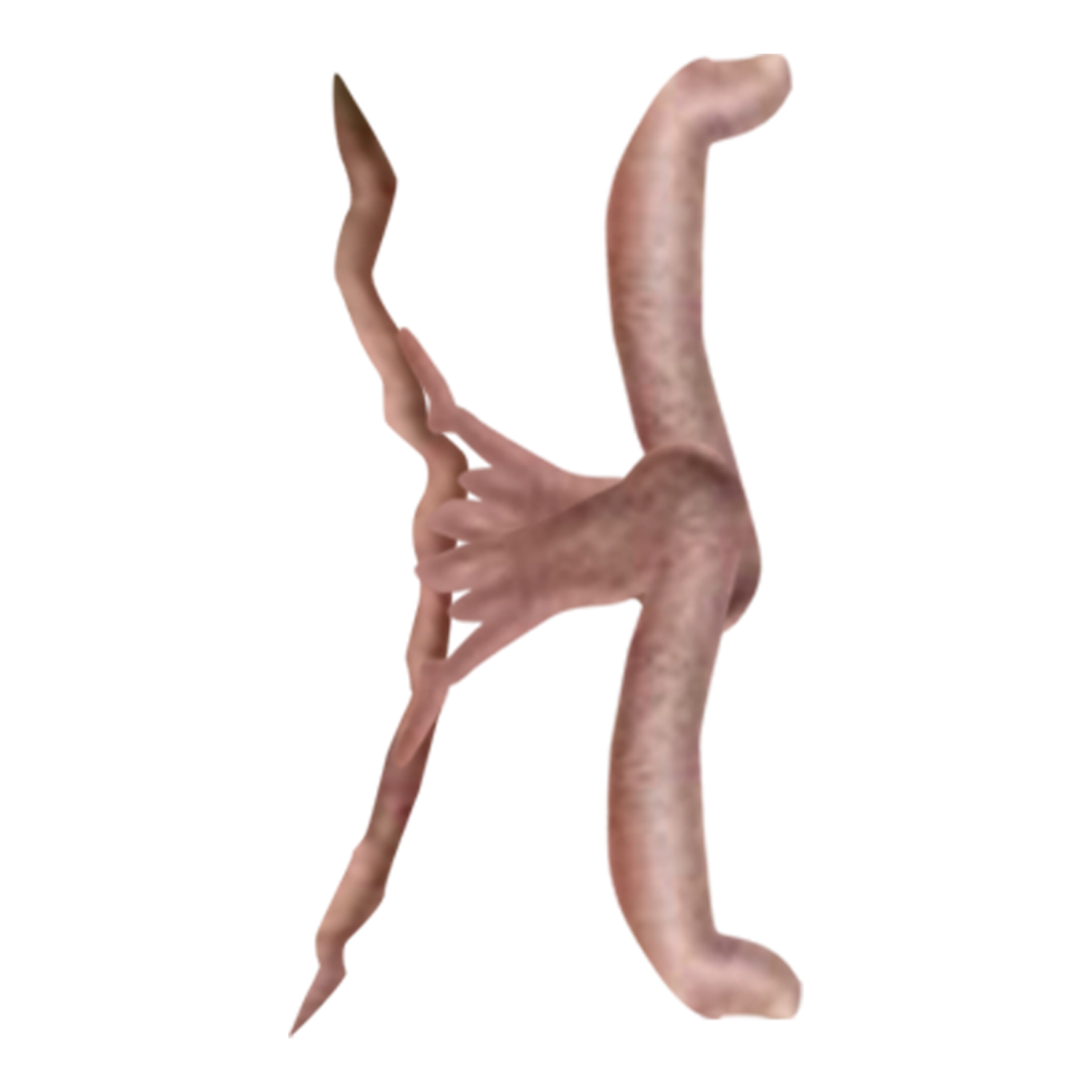


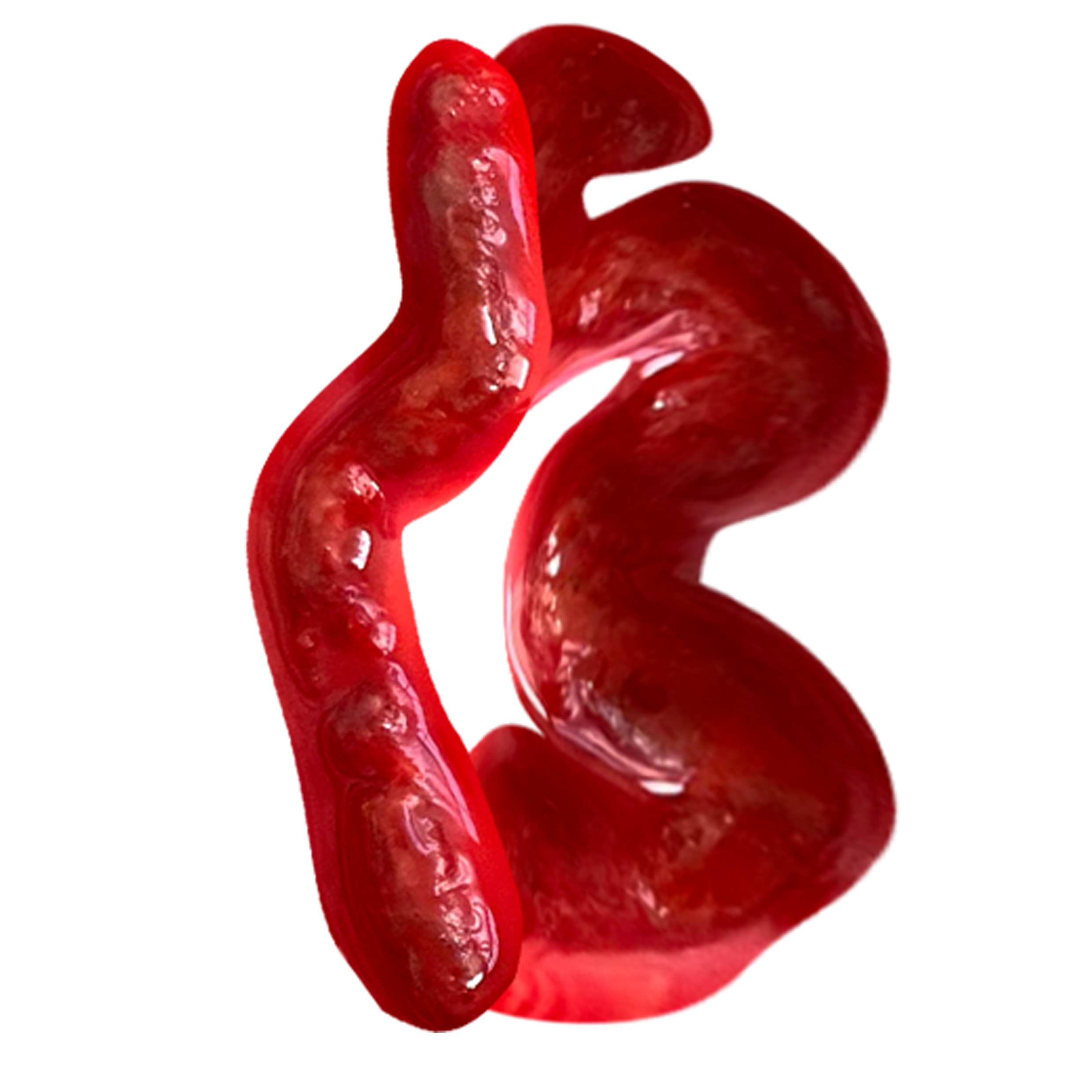
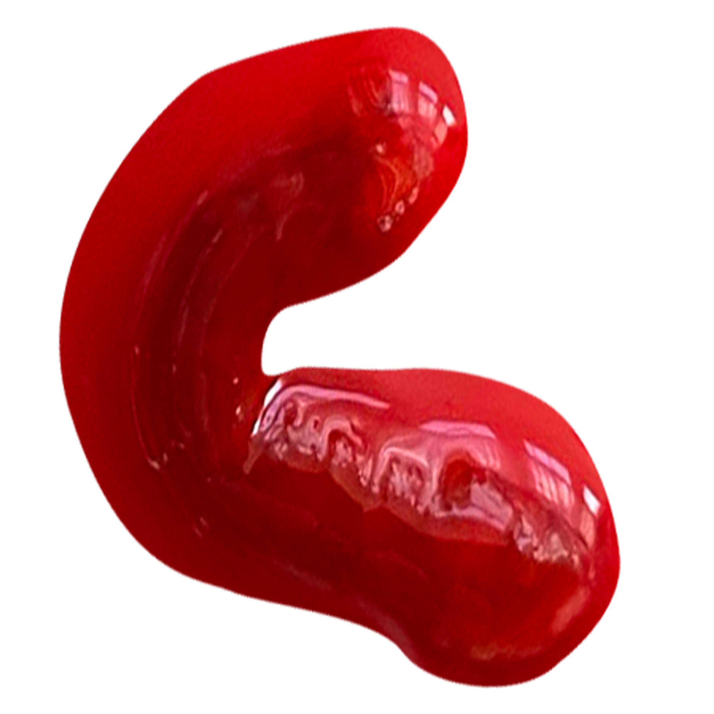
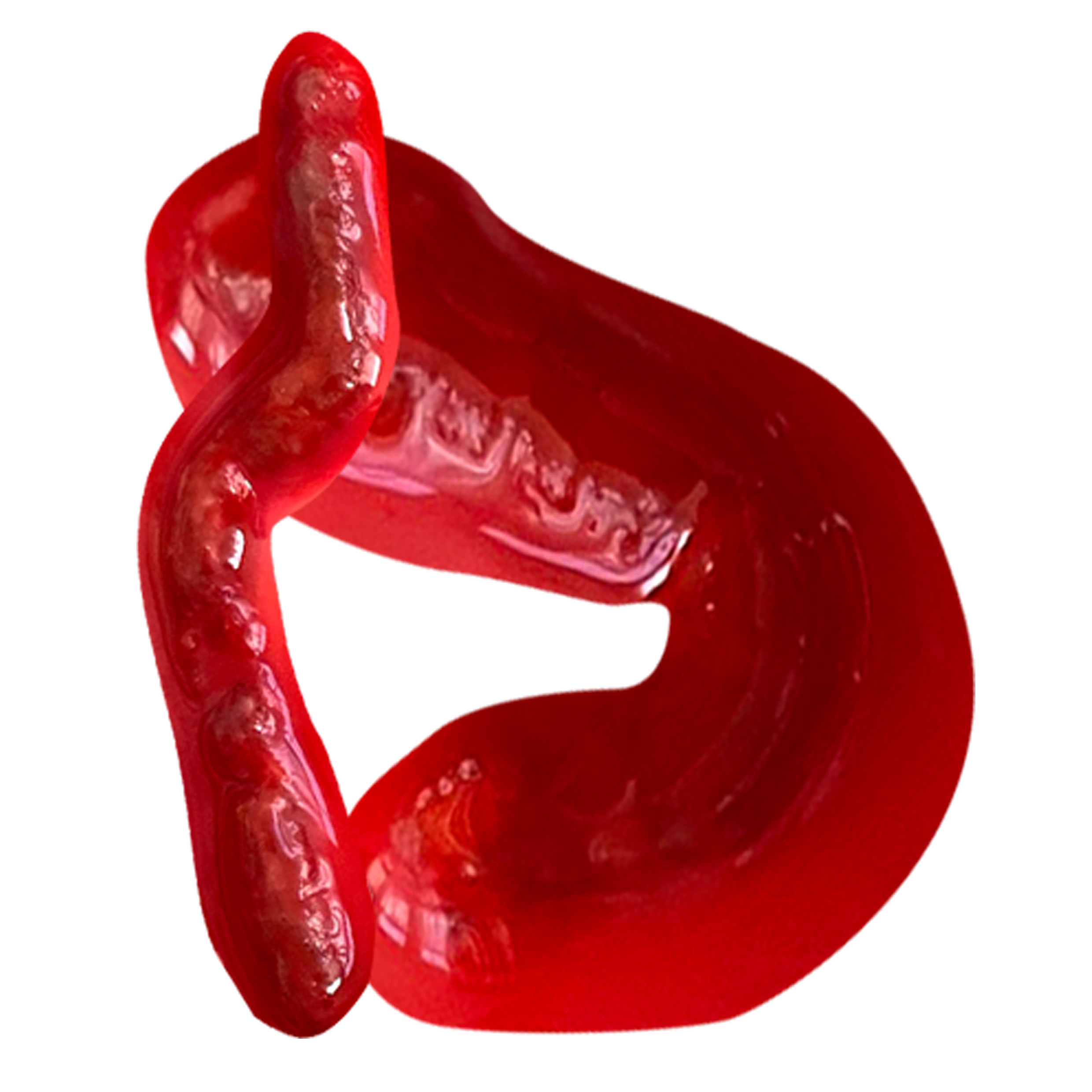
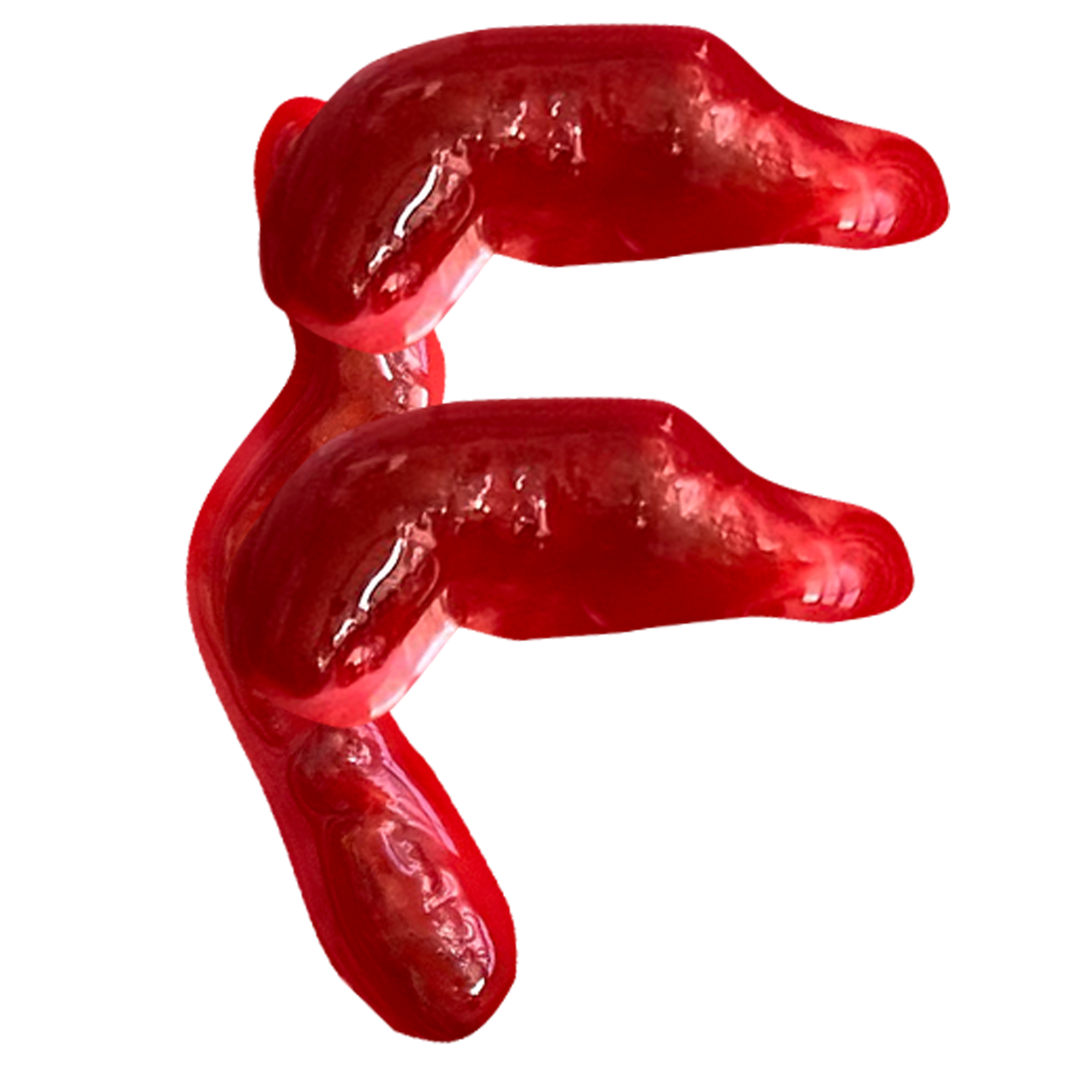
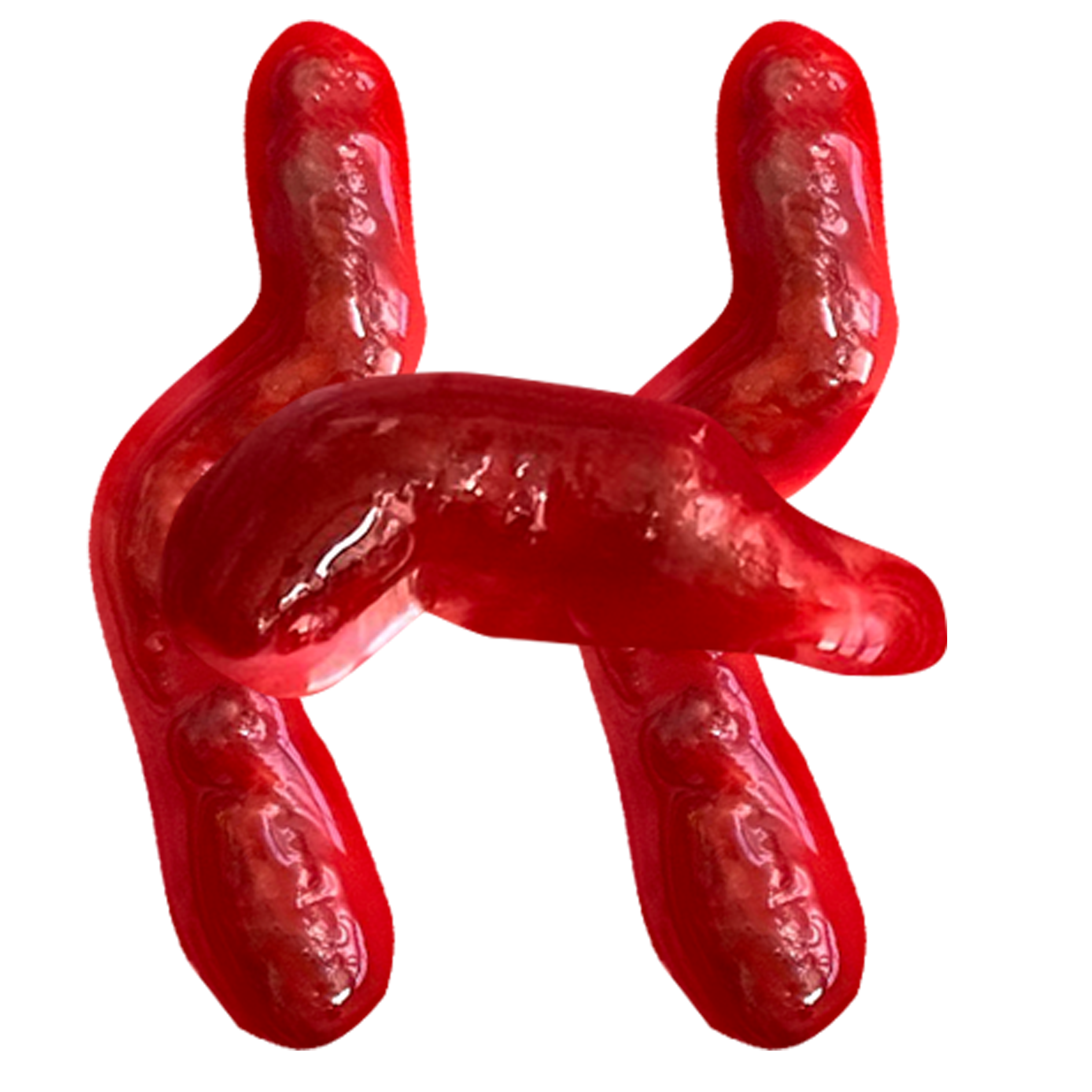
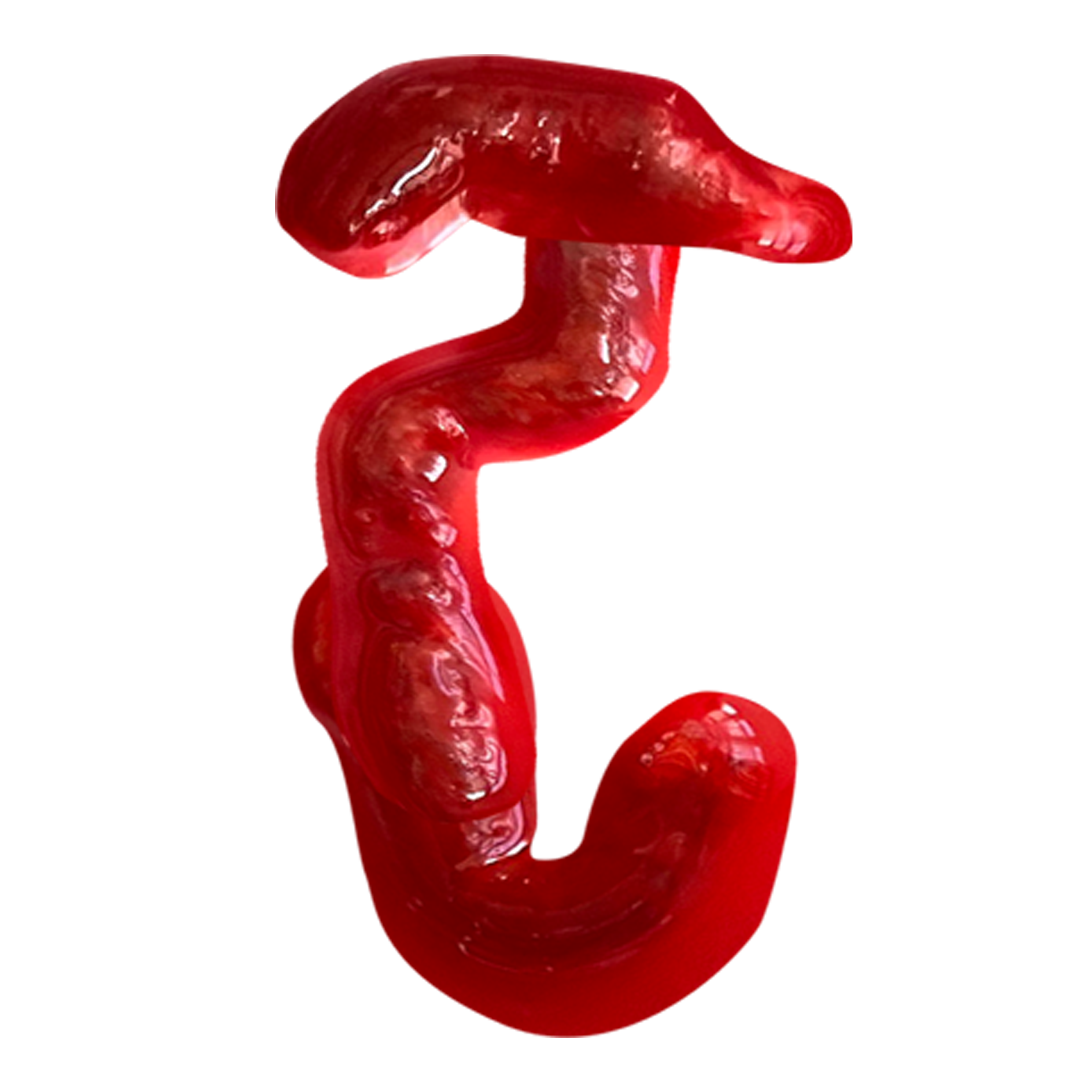
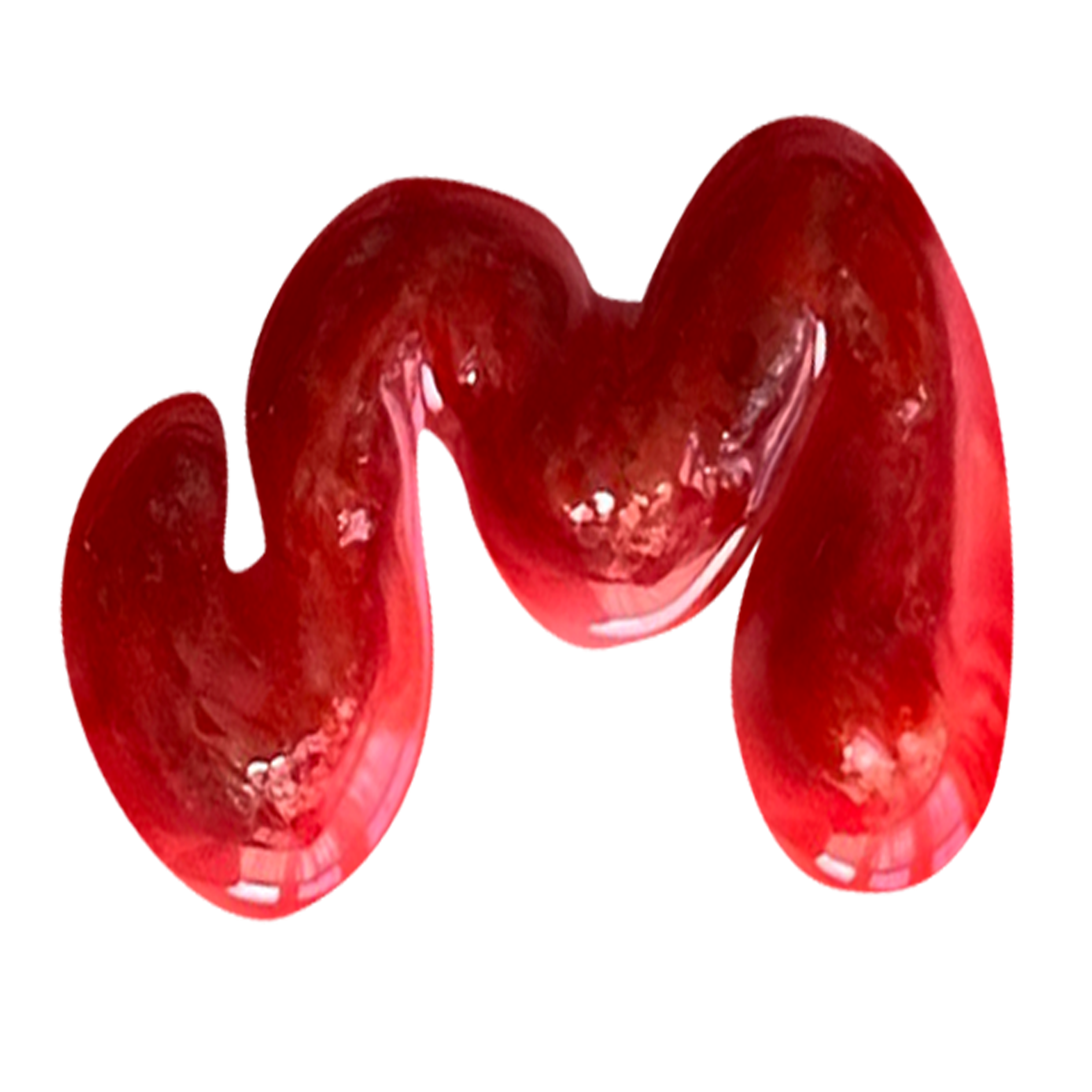
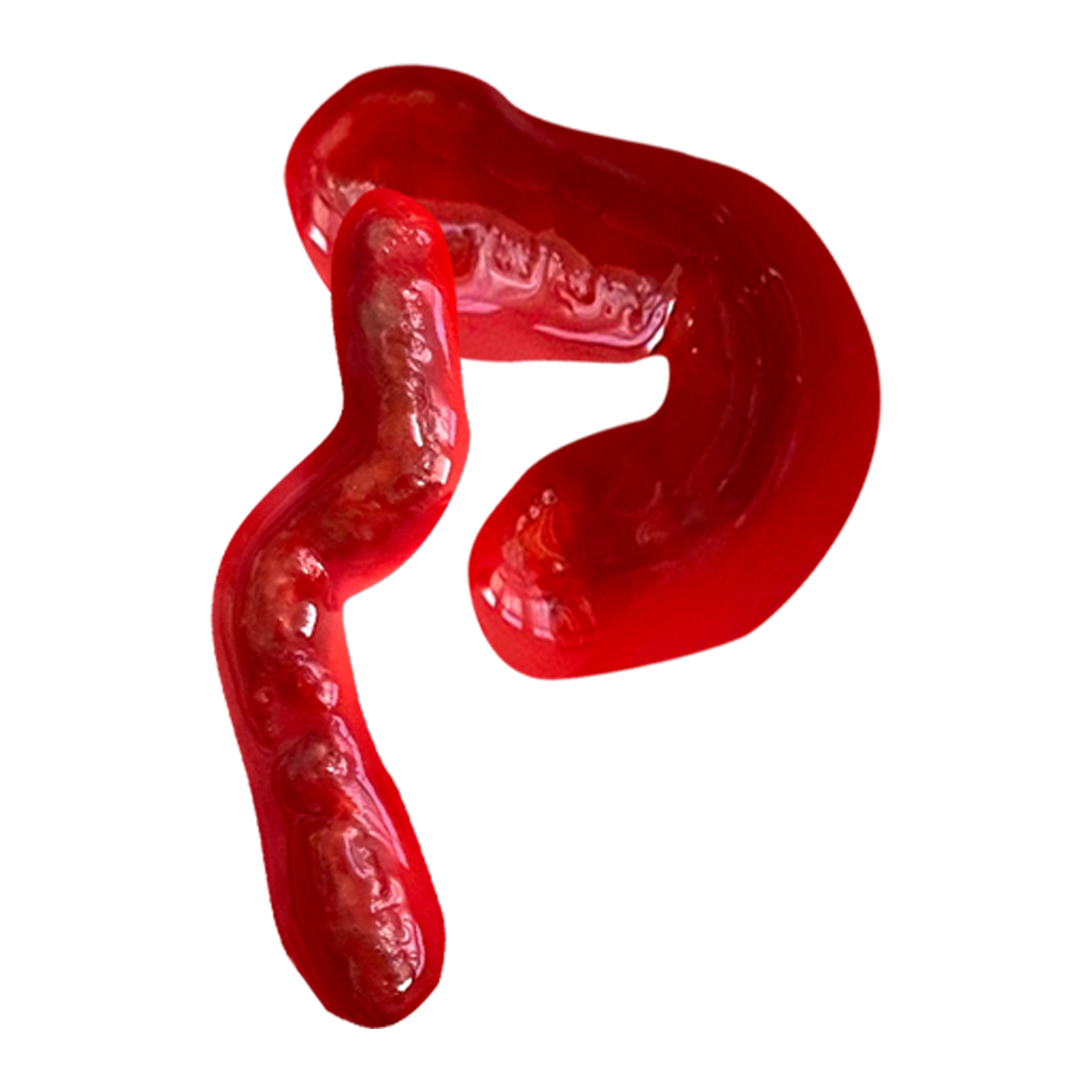
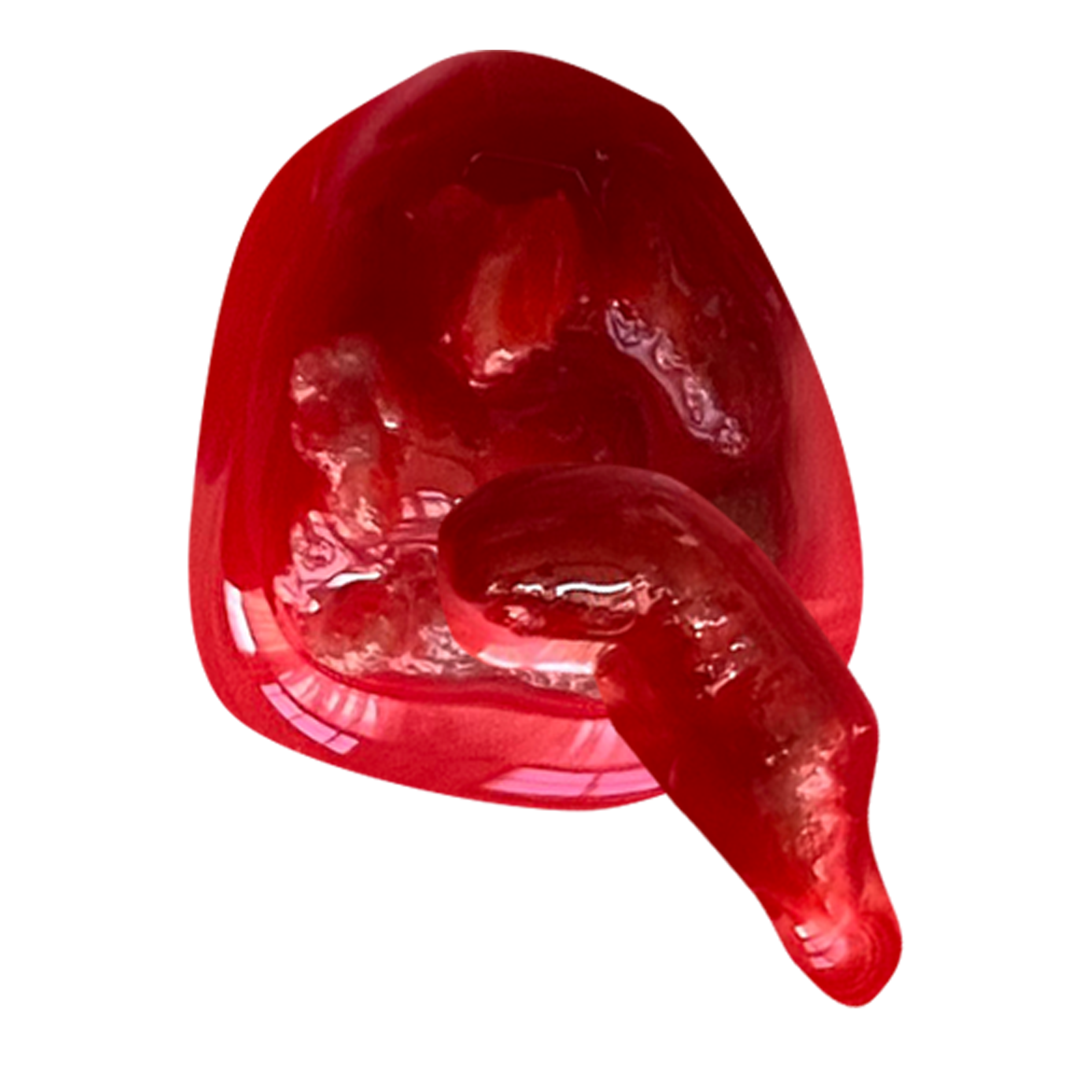
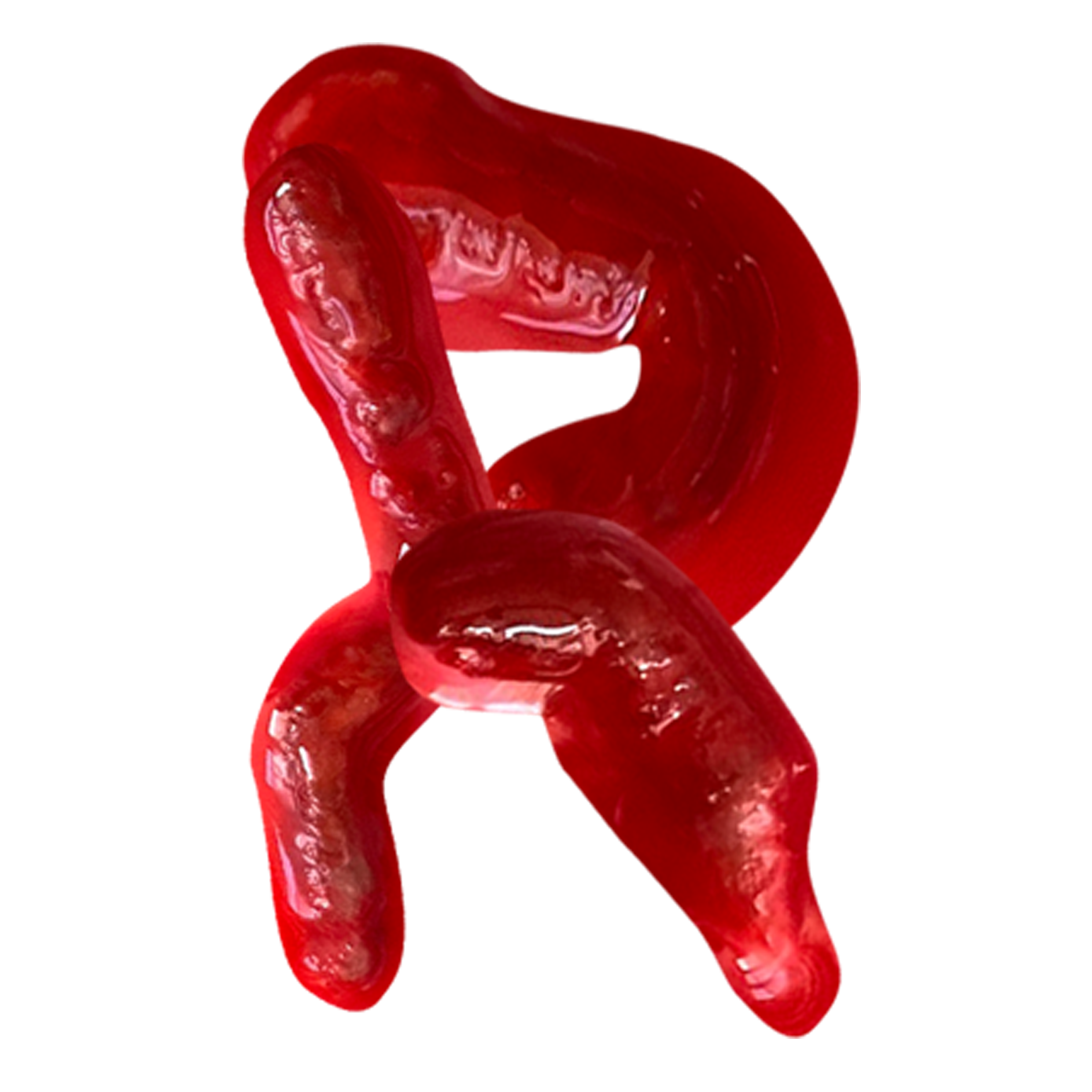
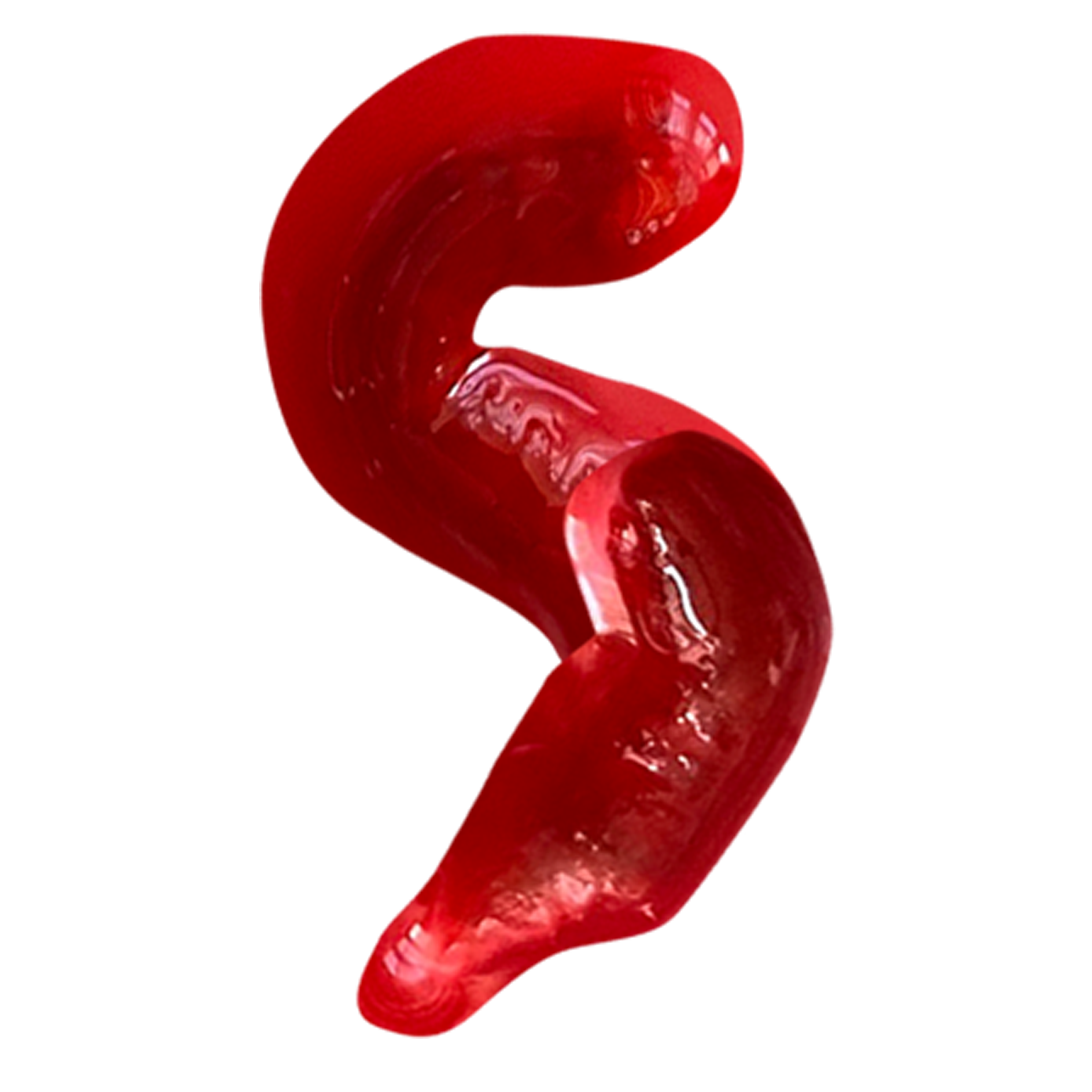
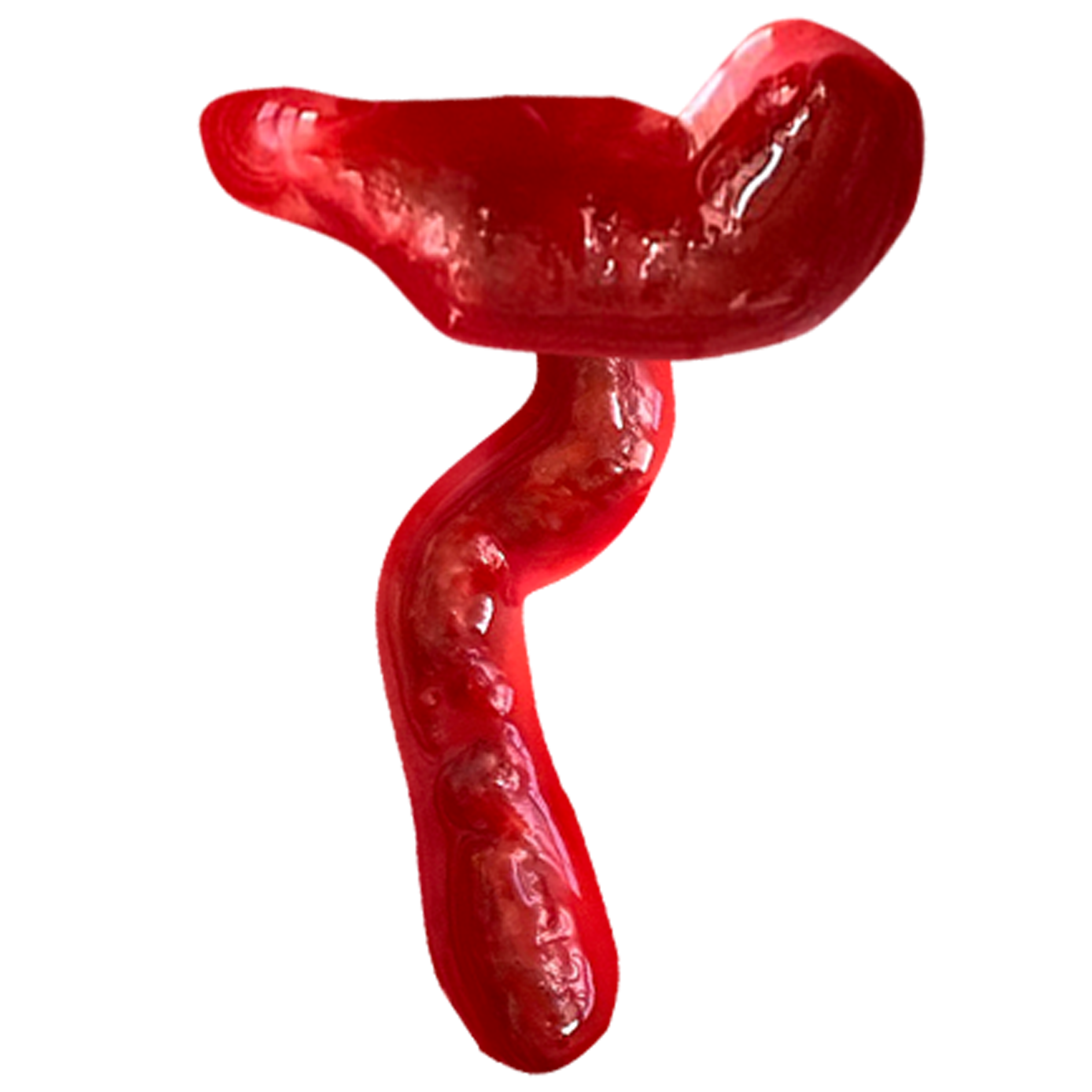
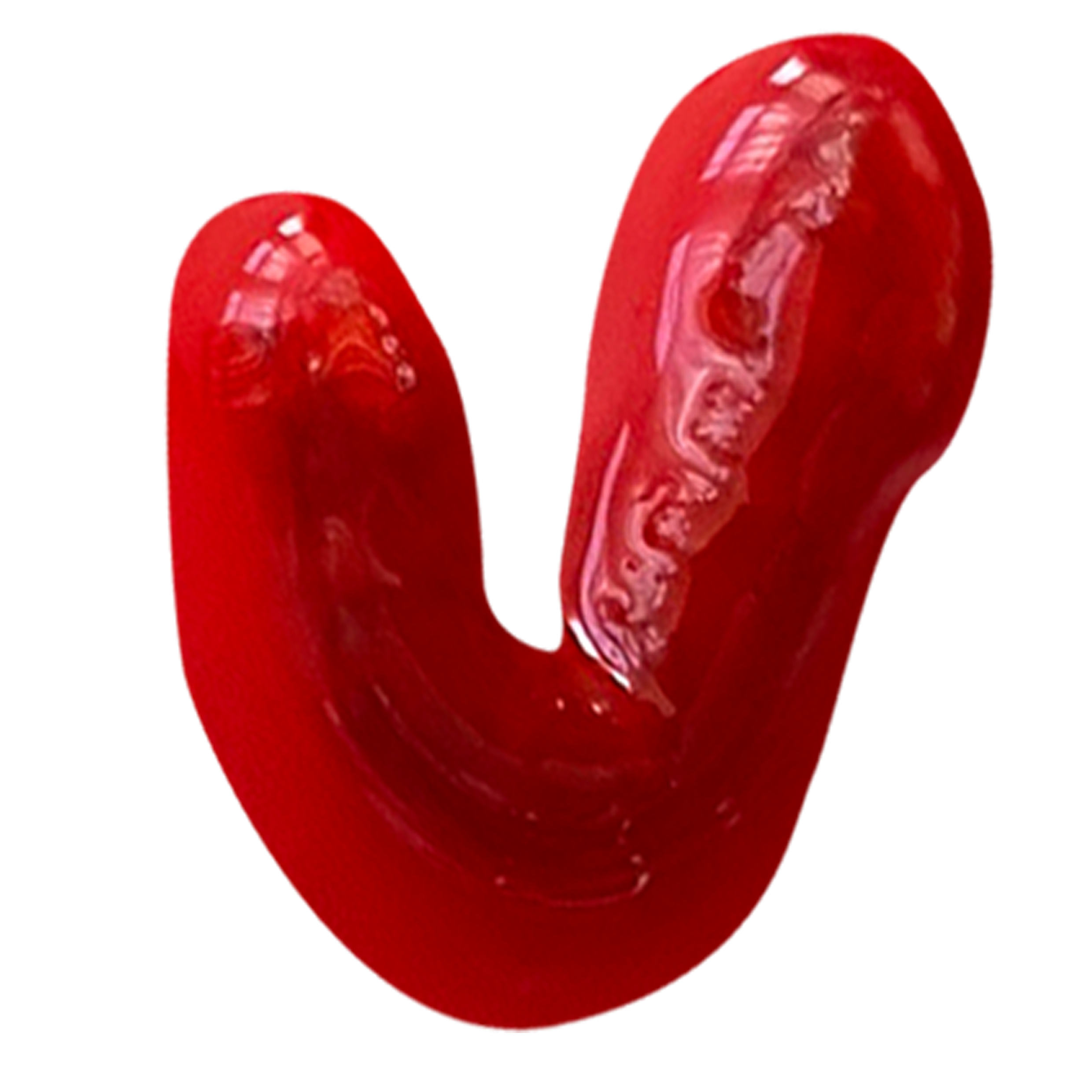
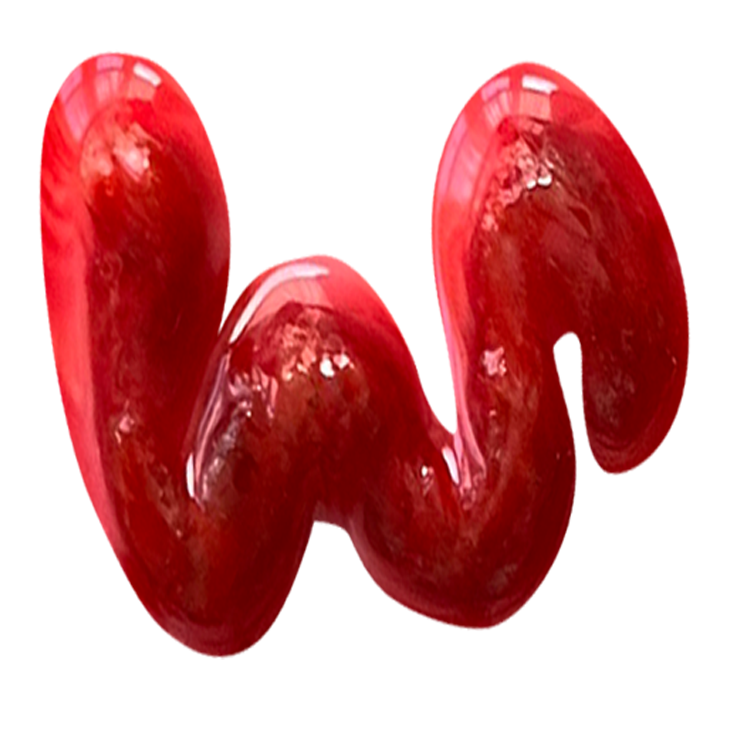
“Kitshy Intestines”
Is a font inspired by the kitchsy, over dramatic practical pecial effects featured within Horror films of the 70’s and 80s. The inspiration came from David Cronenburg’s Filmography and the documentary series on netflix entitled ‘the movies that made us’ which showcased the talents of special effects teams on films such as ‘Friday the 13th’, ‘Nightmare on elm Street’, and ‘Alien 2’. The way that these gory effects were created were down to resourcefulness and inginuity on a small budget, The concept of creating this typeface followed a similar principle. The modular typeface was created from red food colouring, PVA and mincemeat, using practical everyday items to create a disgusting and disturbing three dimensional font that would not look out of place within a modern horror film poster.


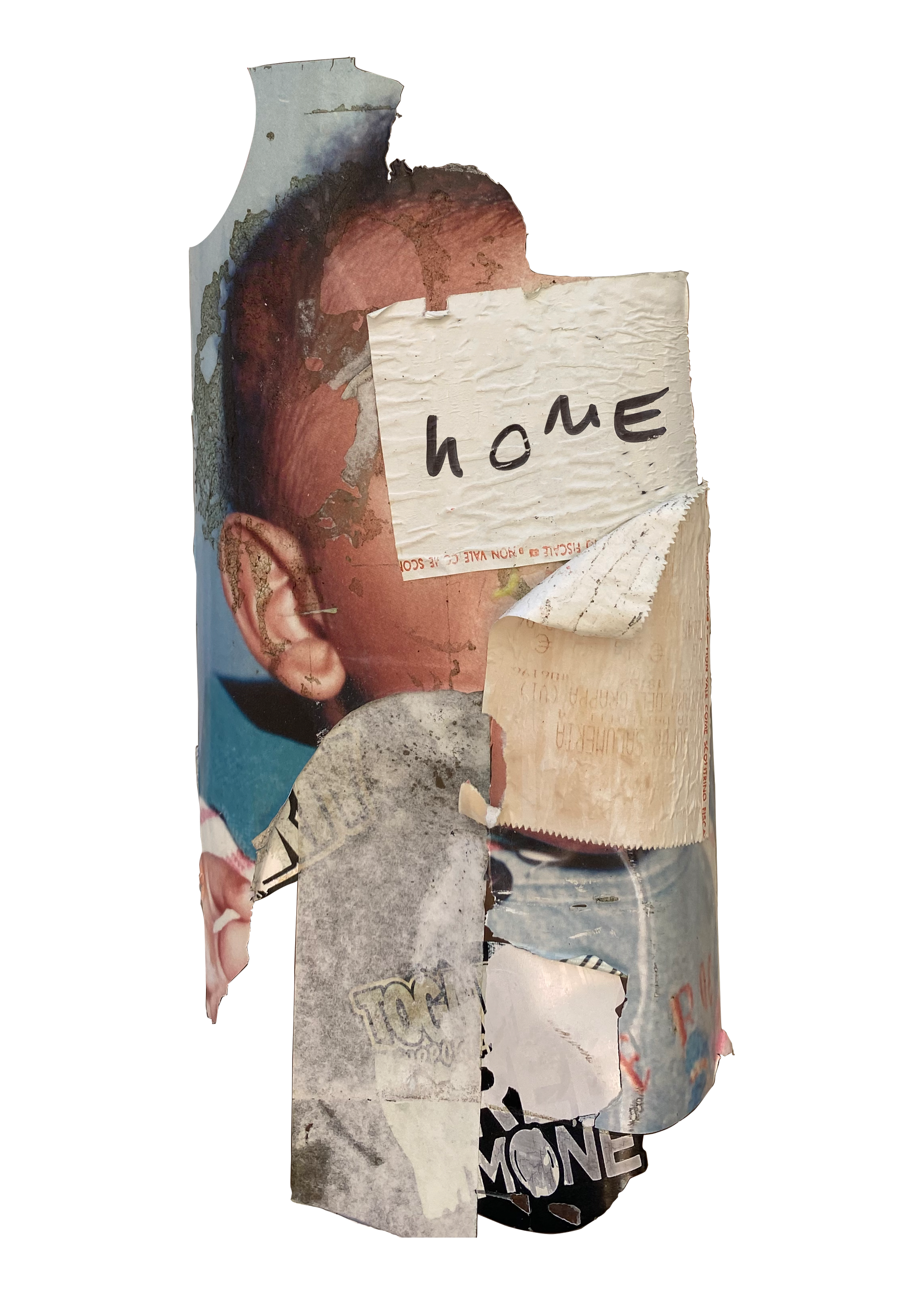
“For A Minute”
A bespoke typeface designed for the speech bubbles in the official “For a minute” comic book for Chiedu Oraka’s merchandise bundle celebrating the release of “Council Estate Confidence”. Modular forms from the typeface were taken from a North Face hoodie inspired by the title of one of the EP’s singles- “North Face”. the fluidity of the creases from the material, created a bold and expressive typeface that replicated the attitude that the rapper conveys within his music. The font was an integral element in sculpting the visual identity for the artists merchandise.