“The Vanishing Lighthouses of Spurn”
(2022)
“The vanishing Lighthouses of Spurn “ is a publication which celebrate the rich distinctive history of Spurn points Lighthouses, it is an informative booklet that aims to bring back to life the buildings that have been swept away by the sea and recount the fascinating stories surrounding these light-
houses over the centuries.
houses over the centuries.


Due to Spurns unique geographical properties, and its shores holding the title of the fastes eroding coastline of europe, its dangers have demanded lighthouses to protect sailors dating all the way back to the 13th century, this has meant that there have been lighthouses that have existed in this one area that represent numerous architectural properties specific to time periods spanning throughout English history, the booklet
honours the historical ingenuity demonstrated within these buildings. Each of the publications pages represent a different time period and the lighthous that stood during this time, beginning with the first lighthouse built in 1427, all the way through till the present day lighthouse that stands today. Through the use of ‘Helsingin Sanomat’, a font that comes in a variety of widths, with each variation representing a different to NSIDC’s (National Snow and Ice Data Center) Arctic sea ice data from 1979 to 2019 and IPCC’s prediction all the way to 2050.
The font has been adopted within the publications design to represent the decay through erosion throughout Spurns history, beginning with the lightest to represent the 13th century, in which there are
merely a few stones, and a royal patent that evidence the lighthouse and its surrounding settlements existence.
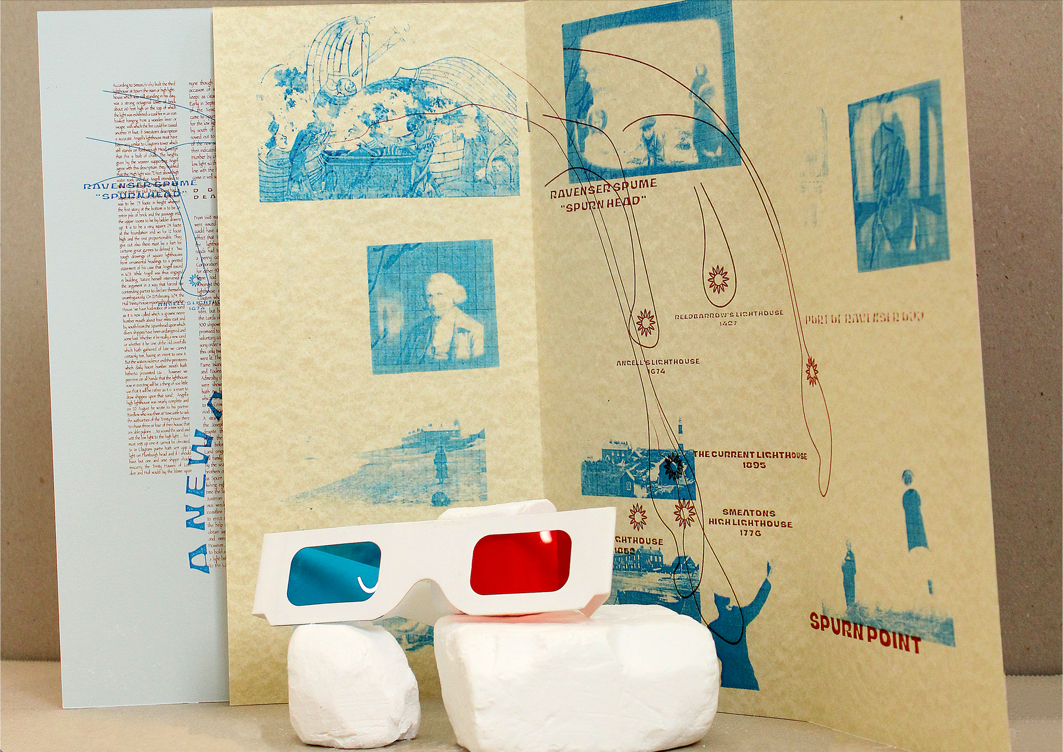
To celebrate the unique characteristics of each lighthouse respective to its time period, each body of text has been formatted and arrange within a self invented grid, that has been designed with an aspect of the lighthouses distinctive features in mind. Papyrus was chosen for the body text as a playful nod to the Hidden Holderness group and their lost villages of spurn brochure. Expressive and playful Headings and subheadings have also contribued to inform the viewer of the characteristics of spurn or the buildings that existed there.
Imagery has been placed strategically over the top of the informative elements within the design, with clean line illustrations that showcase the lighthouses features and also details of spurns ever changing geographical
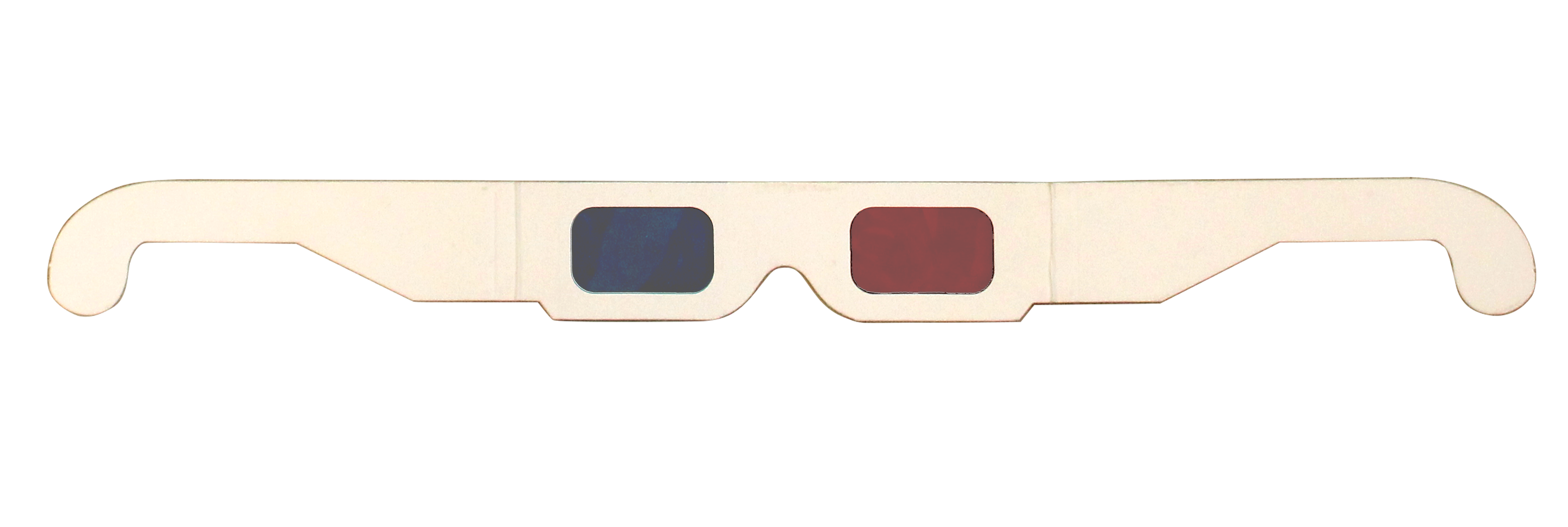
position over the years, these elements have been overlayed on top of one another in Blue and Red ink to create an exciting illustratve piece of print that invites the viewer to inspect firther, the publication comes with a set of 3D glasses to aid navigation of the pages, using each side of the lense allows for one aspect of the publication to become clearer revealing information in an engaging way to its audience.
Paper was carefully selected to compliment the Blue and Red printed elements, stocks were chosen to enhance the nautical theme of the design; GF Smiths Extract in Shell, Cool Blue, Parch Marque and Transclear were selected to enhance the inks and also represent the maritime colour pallette.
honours the historical ingenuity demonstrated within these buildings. Each of the publications pages represent a different time period and the lighthous that stood during this time, beginning with the first lighthouse built in 1427, all the way through till the present day lighthouse that stands today. Through the use of ‘Helsingin Sanomat’, a font that comes in a variety of widths, with each variation representing a different to NSIDC’s (National Snow and Ice Data Center) Arctic sea ice data from 1979 to 2019 and IPCC’s prediction all the way to 2050.
The font has been adopted within the publications design to represent the decay through erosion throughout Spurns history, beginning with the lightest to represent the 13th century, in which there are
merely a few stones, and a royal patent that evidence the lighthouse and its surrounding settlements existence.
To celebrate the unique characteristics of each lighthouse respective to its time period, each body of text has been formatted and arrange within a self invented grid, that has been designed with an aspect of the lighthouses distinctive features in mind. Papyrus was chosen for the body text as a playful nod to the Hidden Holderness group and their lost villages of spurn brochure. Expressive and playful Headings and subheadings have also contribued to inform the viewer of the characteristics of spurn or the buildings that existed there.
Imagery has been placed strategically over the top of the informative elements within the design, with clean line illustrations that showcase the lighthouses features and also details of spurns ever changing geographical
position over the years, these elements have been overlayed on top of one another in Blue and Red ink to create an exciting illustratve piece of print that invites the viewer to inspect firther, the publication comes with a set of 3D glasses to aid navigation of the pages, using each side of the lense allows for one aspect of the publication to become clearer revealing information in an engaging way to its audience.
Paper was carefully selected to compliment the Blue and Red printed elements, stocks were chosen to enhance the nautical theme of the design; GF Smiths Extract in Shell, Cool Blue, Parch Marque and Transclear were selected to enhance the inks and also represent the maritime colour pallette.