
“Put A Donk On it!”
(2020)
Donk was a dance music micro-genre that reached the hight of its popularity between 2000-2010 which involved appropriating characteristics of gabber, hardcore house and techno with the addition of the "pipe" drum sample on the offbeat of the baseline and rapid MCing with thick northern accents over the top.
The genre was considered the lowest form of dance music to many of its critics within the uk rave scene however, the genre has developed a cult following over recent years and as a result, listeners celebrate it’s ‘brainless’, unserious and crude qualities. The genre is synonymous with working class northern youth culture.
Design associated with the genre reflect the amateurish quality of the music, with tacky design cliche’s, and plagiarized symbols from rave culture.
Donk is integral in understanding chav culture and Wigan Pier Nightspot was the hub for the music, it was a venue that brought this community together. Shirtless boys wearing trackie bottoms, trainers and pumped with steroids, and girls smothered in fake tan in neon bikinis were synonymous with the genre. After the closure of Wigan pier in 2011, the micro genre was given a new lease of life in the UK travelling fair community and is now as much a part of the fairground identity as the waltzer itself is. Due to the vast range of motifs and ideas to choose from, elements from both the early club nights at Wigan pier and the fairground were combined together to inform the viewer of the genre.

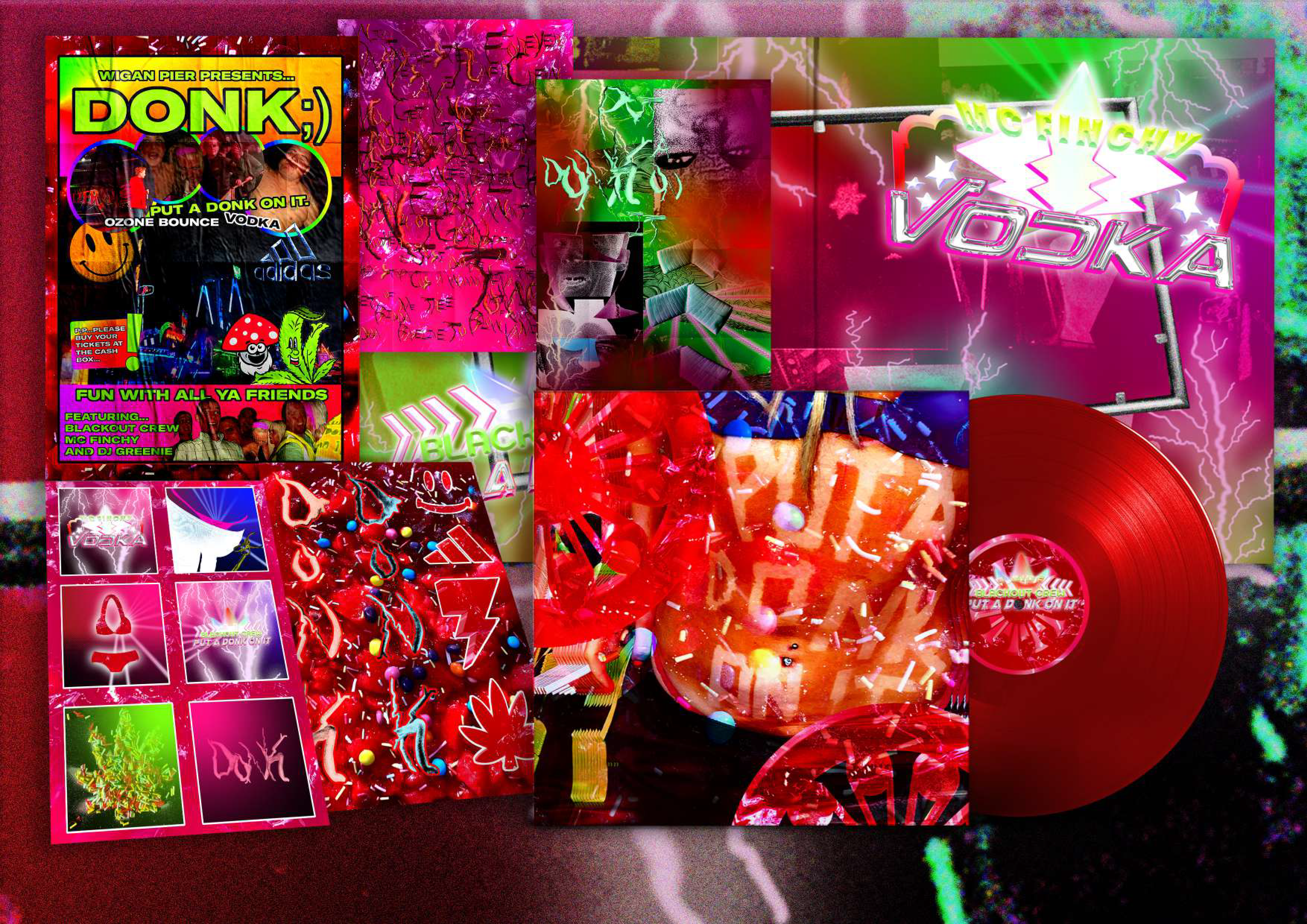
7 inch sleeve
To reflect the Wigan pier rave scene, the 7'' records outer sleeve was a photographic image in which blackout crews "Put a Donk on It" was written in fake tan on a model sporting "Trackie" bottoms, and illuminated clothing, the image were offset and repeated 150 times spreading from front to back to communicate the rapid bpm that's characteristic of the music. The flat image was treated with an undulating wave distortion in order to reflect not only the bouncy atmospheric quality of the drum sample but also the undulating platform that creates motion within the waltzer. image saturation was also increased to reflect the high energy and chaotic nature of the music.
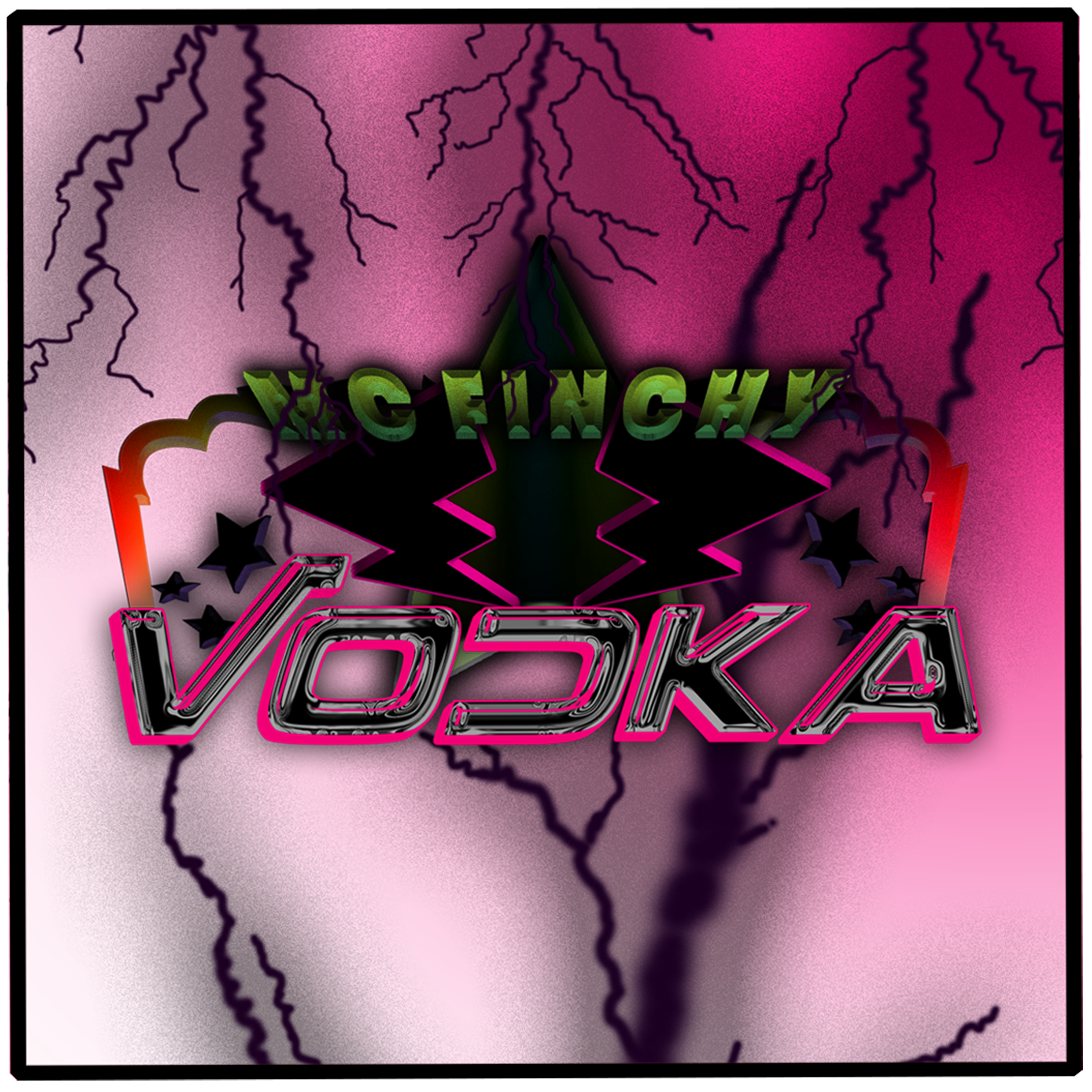
The inner sleeve focused on Donks fairground link, there was a base layer of collaged imagery of the Hull fair landscape combined with images of a topless raver attending a blackout crew gig at Wigan Pier. this collage was overlaid with airbrush elements inspired by Paul wright a brush artist who was responsible for the airbrush art on many of the main attractions at Hull and Nottingham Goose fair. design cliches such as lightning bolts, stars and arrows were incorporated into the design to replicate the visual reference of the fairground, along with decorative typography appropriating the styles of lettering, offsets, layouts, colourful gradients, chroming and three dimensional effects and other design cliches seen within fairground ride signage all of these elements and design cliches were built up together in order to highlight the tacky and tasteless elements featured in the design work and musical stylings of the genre. the outer packaging of the record sleeve incorporated the use of architectural symbols of the Uk fairground from three rides that are a part of the "Core Four" (The Dodgems, The Waltzer, The Twister, and the Miami), these rides were chosen as they all are known for playing happy hardcore and Donk music in order to heighten the thrill experience of the riders. The symbols were elevated further to reflect the gaudy over the top characteristics of the micro-genre and placed in the context of fairground confectionary, the texture that the symbols were made from was produced to replicated a toffee apple or red dummy lolly which are two well known fairground food staples heightening the clashing and chaotic maximalist design elements and visually communicating the attitude of the music. The A side and B side labels for the vinyl record were a continuation of the visual elements on the inner sleeve, "Put a Donk on it" by The Blackout Crew was chosen for the A side due to the relevance of the songs title to the meaning of the genre, The Blackout Crews intentions behind the track was to make fun of the producers who take commercial tracks and "slam a donk on it" and call it their song, its also used as a descriptor by listeners of the sound of the off beat baseline that sounds like a "Donk". MC Fincy's "Vodka" was chosen for the B side as the songs lyrics showcase the genres subject areas and imagery associating with "Chav Culture" and overly sexualised crude lyricism. MC Finchy is one of the most highly respected MCs within the genre and Northern rapid MCing is a large part of the musics identity.


Flag Design and extra products
For the flag design, elements of both the rave and fairground imagery to the micro genre were utilised for the concept, the flag was made up of a photographic image without type elements, to focus on the vivid textures and the boldness of the design and also contrast with the busier elements within the final record sleeve outcome, the images backdrop was a red sticky toffee apple texture with sprinkles and sweets stuck within, over the top was a bikini spray painted stencil in silver to in keep with the continuation of the visual link to the airbrush work of Paul wright associated with the fairground attractions whilst also referencing the unofficial dress code of the “Donk Girls” attending Wigan Pier Nightspot.

Within the album package design, two sets of sticker packs were designed as an extra inclusion with the album purchase, the first sticker sheet is made up of a decorative 3D typeface made from the veins of a steroid filled arm, each letter is a separate sticker, when all placed together they spell “Donk” so the consumer can ‘literally’ put a Donk on their album cover or any other item they choose! Other stickers featured on the first sticker pack were symbols from drug and rave culture that were often hijacked in music lyric videos and other design work in the genre.
Waltzer signage and other fairground ride design inspired decorative type for the song title have also been turned into sticker designs incorporating the airbrush elements within the backgrounds to provide the strong visual fairground motif. The bikini imagery is also utilised again with the symbol made out of the red toffee and finally a cutout of a pink thong and “trackies” to reiterate the neon skimpy dress of the ravers.
Three posters were also created to go along with the album, the first was a poster Hijacking the design cliches of a funfair poster, the second poster is a type only design using famous and notable lyrics from ‘MC Finchy’ and ‘The Blackout Crews’ Songs in a decorative vein typeface. and finally a more abstract experimental poster using clashing design elements from both of the former posters with symbols made from sweets, red toffee textures, collage consisting of imagery of Wigan Pier Ravers and finally some airbrush elements, visually referenceing Donks links to the rave scene in the 2000s and its part in the UK fairground soundscape.

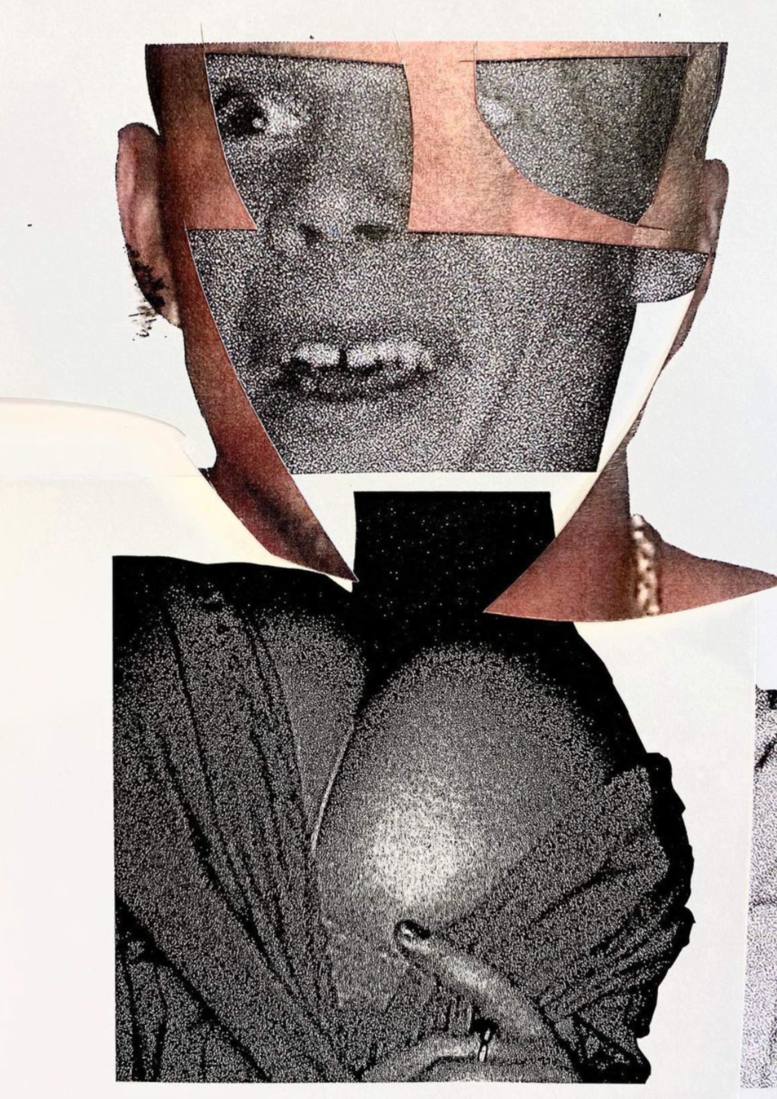


The following images are some early experimentation and collages created in the early stages of the project.
‘Roid Rage’
An original typeface inspired by pumped up viens seen on men who take steroids, a prevelant drug used by men in the ‘Donk’ scene.
