Council Estate Confidence
(2022)
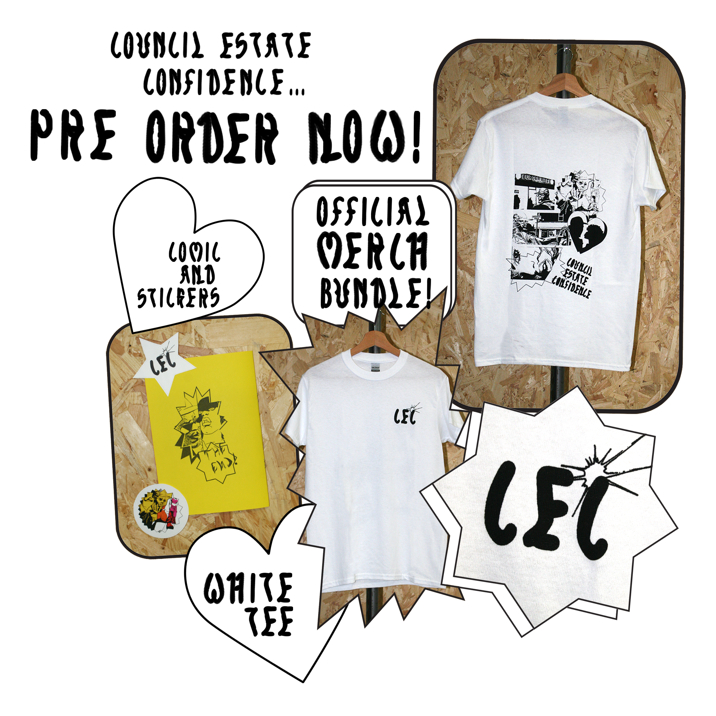
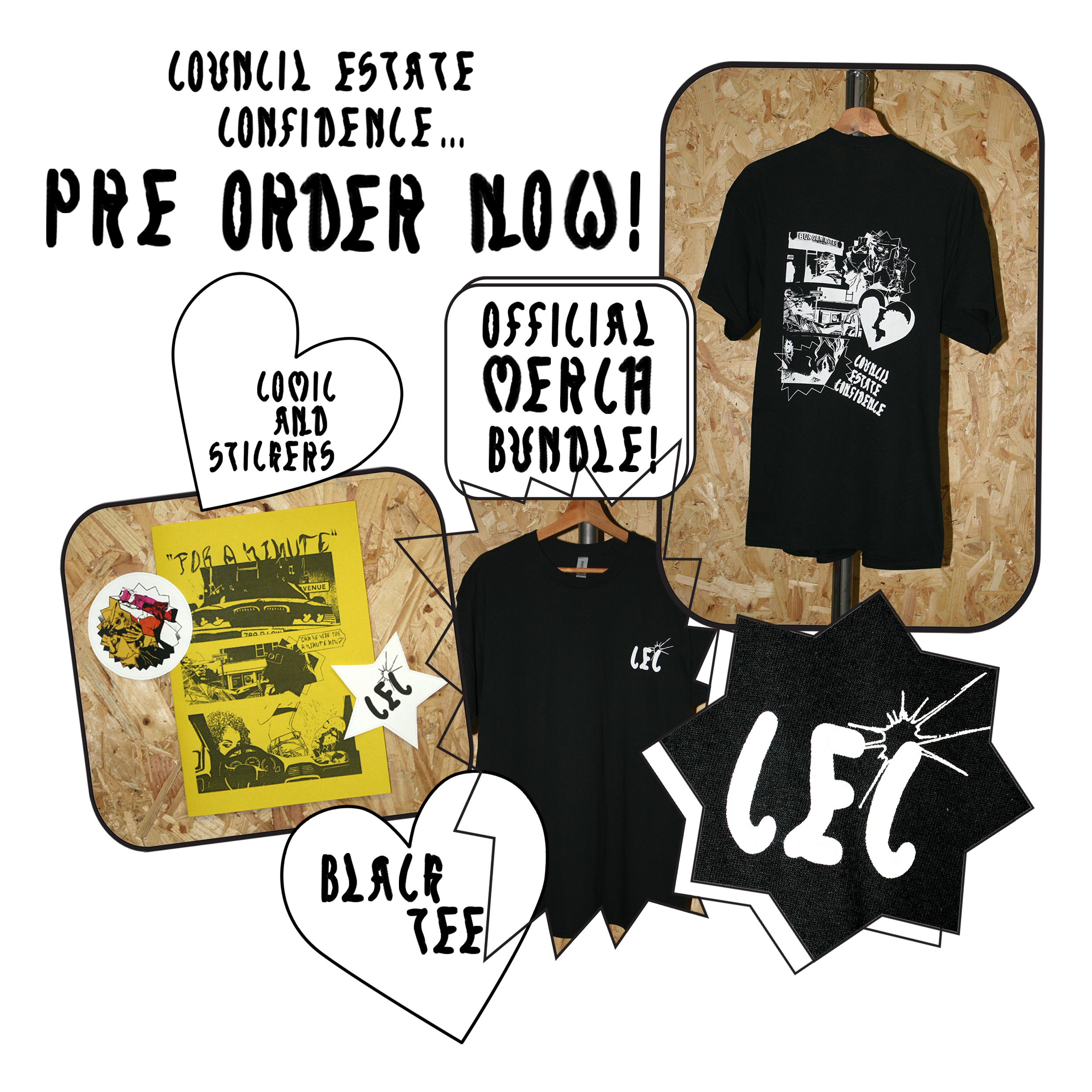
Council Estate Confidence was a collaberation with a well-Known local musician called Chiedu Oraka, who’s aim within his music is to champion and de-stigmatise his upbringing on North Hull Estate, an area typically viewed as underfunded and with less resources, for several months we worked together and collaberated on promoting his upcoming E.P release ‘Council Estate Confidence’ with a social media campaign, in which I created the Concept, Design and animations. I then pitched a merchandise release for the artist that included a Bespoke Comic, T-shirt, and Sticker design That proudly ‘donned’ the ‘Council Estate Confidence’ slogan.


Merchandise.


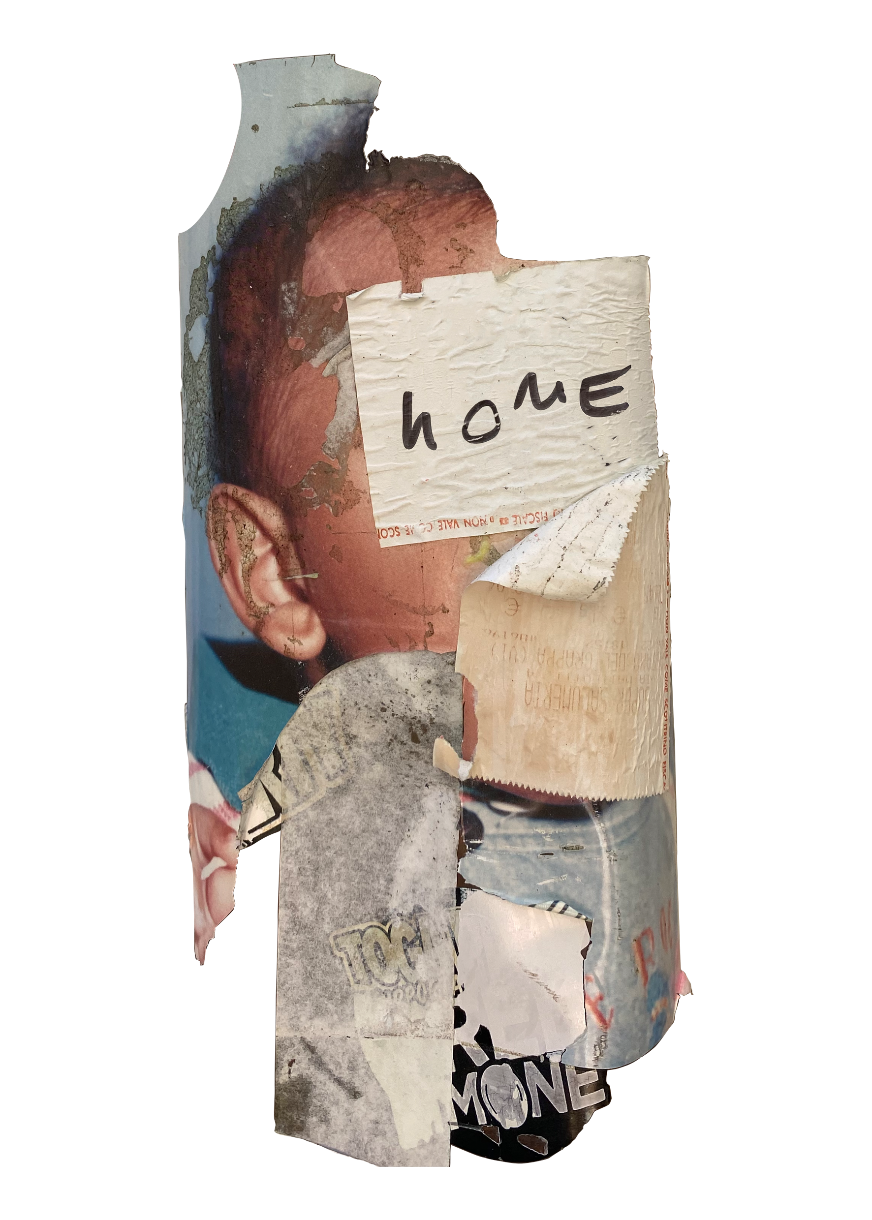
Visual Elements and motifs are also borrowed from ‘Corner Shop’ ephemera such as price tags, labels and junk food packaging to compliment the rest of the EP’s context and other promotional content. The artist discusses within alot of his music about how he likes to celebrate small local businesses such as takeaways, chicken shops and ‘Off licenses’ which are synonymous with council estates, he recognises and acknowledges that they are a part of his upbringing and wishes to change the way in which the media views these places associate with the working class.
Two bespoke typefaces were created for this outcome as a result of the artists desire to celebrate the aspects of working class culture that he grew up with that are associated with being ‘Chavvy’, The first is a modular typeface created from a nike tech hoodie, and a north face jacket, as an ode to the name of the other Doube A single on the EP release entitled ‘North Face’, another item associated with ‘Chav’ Culture. The second Typeface was created from type used within in Off licence sale price tags and labels.
The comic Strip uses flourescent colours and to pay tribute to the aesthetic of flourolabels found in cornershops, shapes found from these labels were also utilised. The illustrations themselves were sampled from vintage ‘2000AD’ comics and an american comic strip called ‘100 Bullets’, The illustrations were altered, distorted and rearranged, facial expressions were changed to suit the context of the narrative, and contents of the original illustrations completely rearranged through digital collage.
The sampling of imagery also was inspired by the history of Comic illustrations within Hip-Hop, and how the two artforms are synonymous with one another in the eyes of Hip-Hop Fans.
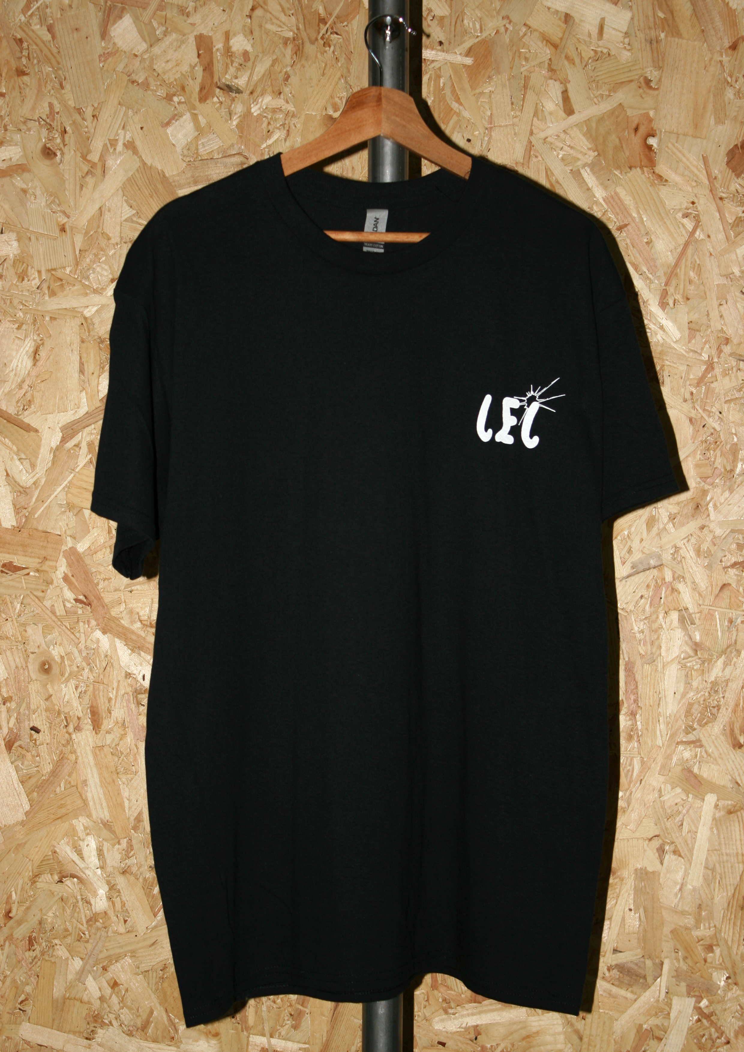
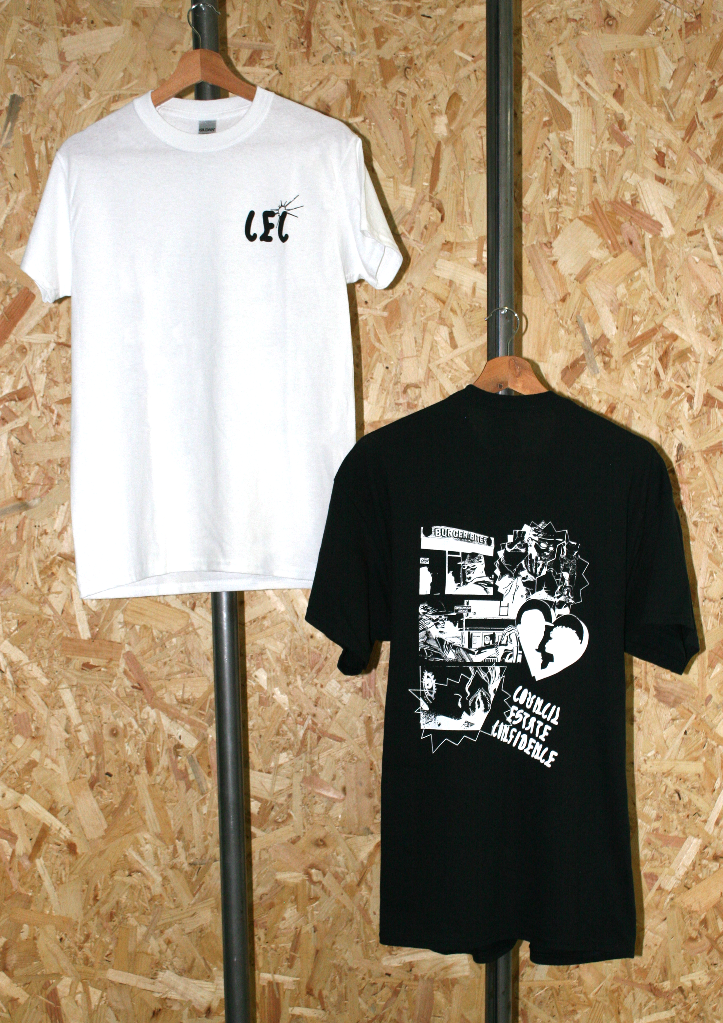
The T shirt designs created were also another selling point to inkeep with
the buzz of the EP’s release, it would allow fans to take something for themselves from the album, and have something specific for this song release. The
design is alot more minimal to appeal to a young and trendy demographic,
someone who the artist would envision wearing their merchendise, the back
design featured a smaller section of the comic strip and the front featured a
small logo of the title of the album using A bespoke typeface inspired by off
licence and corner shop ephemera.
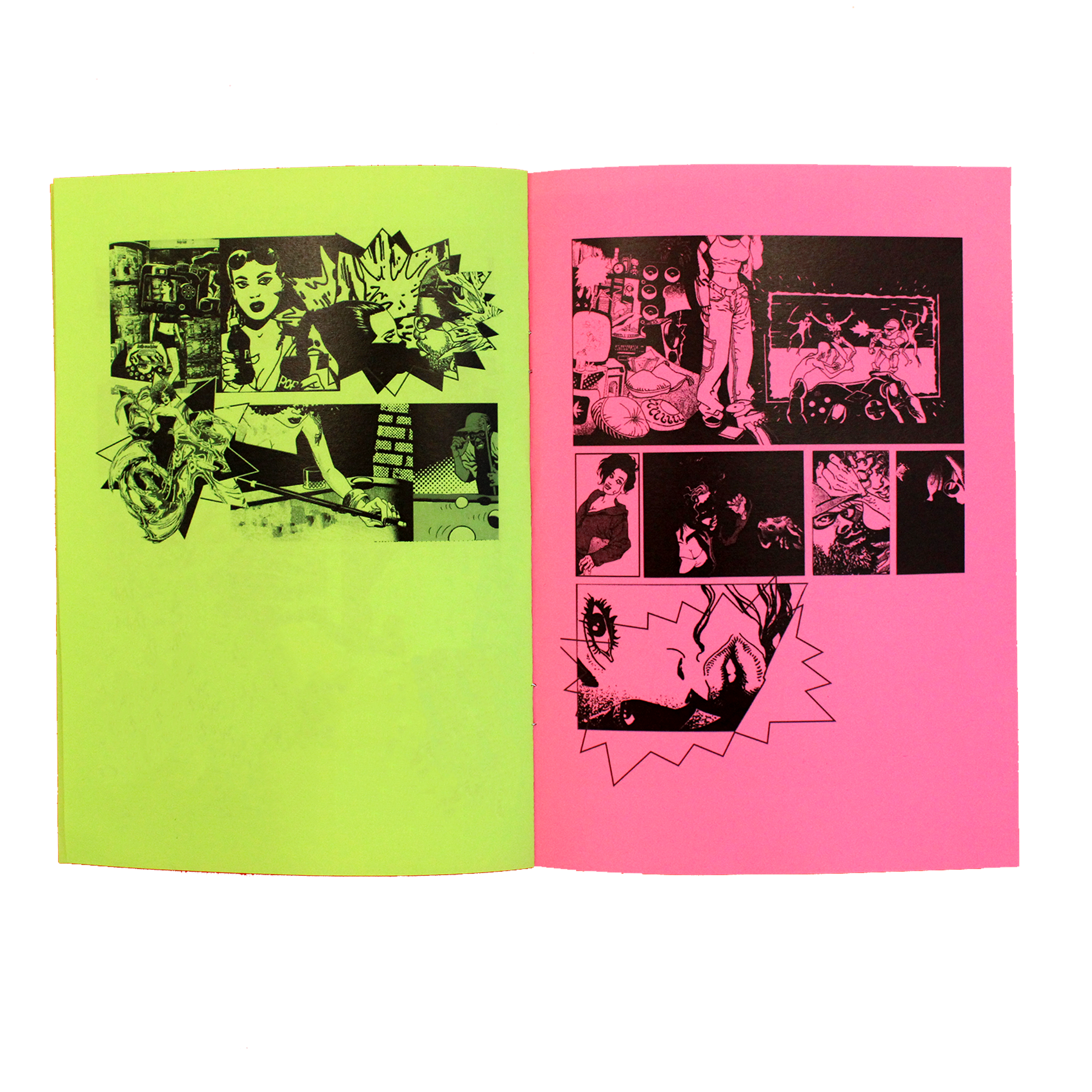


As an extra deliverable to compliment a physical release, a printed version
of the comic book was also created, this medium of the comic would be a
possible addition to a physical CD or record sleeve package, in order for
the audience to recieve a visual reference to the songs concept and keep in
contiuation with the promotional contents identity. In book form, as a viewer
you can also appreciate the content in more of a cronological narative as
oposed to sporadic posts on instagram.
Promotion.

Animation Stills.
The For a Minute’ comic series is a sequence of kinetic posters designed
to visually tell the narrative of Chiedu Oraka’s single ‘For a Minute’, the
series is specifically designed to fit in with the posting specifications of
instagram in order to reach the artists audience through social media.
The comic is split into 6 sections to concisely reflect the story-telling of each of the songs verses, as the narrative progresses within the music, you can see this reflected within the posters. The full song revolves around meeting the girl of the artists dreams, asking for her number, and progresses to catching feelings and becoming settled and comfortable with this girl, to the point where going out doesnt really matter anymore.
The final outcome aims to highlight the lyrics in the best possible light through the medium of an animated comic strip, a format that is universal and recognisable, throughout Hip-Hop history, comic book referencing has become synonymous with the culture of rap, it is something that the younger Hip-Hop audience responds to and therefore stylistically this suited the artist well.


https://www.instagram.com/p/CeegEqYLPEP/
https://www.instagram.com/p/CdvwKEoMXlI/
https://www.instagram.com/p/CgkPBqYr4Fe/
Branding.
‘Off Licence’
Is a playful modular typeface that parodys price tags and flourecent labelling that you find within british cornershops. The fonts original purpose was for some promotional content and T shirt designs for Chiedu Oraka for his E.P release “Council Estate Confidence”, with particular focus on the track ‘For a minute’. The fonts inspiration came from the fact that the artist likes to celebrate and draw upon ‘Council Estate’ life within his music, subverting the associations of ‘chavvy’. He is often seen filming music videos within chicken shops, takeaways and cornershops as a nod to his adolescence living in these particular areas.

